Interiors

July 30, 2026
Roy Lichtenstein's Interiors series represents one of the most intellectually layered achievements in twentieth-century printmaking, a body of work that transforms the mundane imagery of furniture catalogues and decorating magazines into sophisticated meditations on taste, aspiration, and the commodification of domestic space. Created between 1990 and 1992, these screenprints demonstrate Lichtenstein at the height of his technical mastery, applying his signature Pop Art vocabulary to source material drawn from 1920s advertising and Art Deco design conventions. For collectors seeking Roy Lichtenstein design prints that operate simultaneously as decorative objects and critical commentary on decoration itself, the Interiors series offers unparalleled depth and visual impact.
The series emerged during a period when Lichtenstein was systematically revisiting and extending the themes that had defined his career since the early 1960s. Rather than returning to comic book imagery or commercial advertising in their most obvious forms, he turned his attention to the visual language of domestic aspiration — the idealized living rooms, bedrooms, and sitting areas that populated mid-century furniture advertisements and interior design publications. This source material connected directly to the Art Deco aesthetic that had shaped American visual culture during Lichtenstein's childhood, creating a bridge between Pop Art interior design and the streamlined modernism of the interwar period. The resulting prints are neither nostalgic nor purely ironic; they occupy a more complex position that rewards sustained attention and repeated viewing.
What distinguishes the Interiors from Lichtenstein's earlier graphic work is their reflexive quality — the way they acknowledge their own status as objects destined to hang on walls, becoming part of the very domestic environments they depict. Several prints in the series include representations of framed artworks within the imaginary rooms, creating a recursive loop that implicates the viewer's own relationship to collecting and display. This conceptual sophistication, combined with the sheer visual pleasure of Lichtenstein's flat colour fields and Ben-Day dots, makes the Interiors series particularly compelling for collectors who value work that operates on multiple registers simultaneously.
Understanding the Interiors series requires recognizing Lichtenstein's career-long engagement with design history and the visual archaeology of American consumer culture. Born in 1923, he came of age during the twilight of the Art Deco era, absorbing its geometric forms, bold colour schemes, and faith in the aesthetic improvement of everyday life. When he began appropriating commercial imagery in the early 1960s, he was drawing on a visual vocabulary that had been established decades earlier, filtering the present through the lens of a recently vanished past. The Lichtenstein furniture ads that inspired the Interiors series carried forward this temporal complexity, presenting idealized domestic spaces that blended contemporary styling with echoes of earlier decorative traditions.
The 1920s advertising aesthetic that informs these prints was itself deeply concerned with the democratization of good design. Furniture manufacturers and decorating magazines of that era promised middle-class consumers access to the refined taste previously reserved for the wealthy, presenting domestic interiors as stages for the performance of cultural sophistication. Lichtenstein recognized that this promise remained central to American consumer culture throughout the twentieth century, even as the specific styles and products changed. By returning to this source material in the early 1990s, he was commenting not only on the particular imagery he appropriated but on the broader cultural machinery of aspiration and display that it represented.
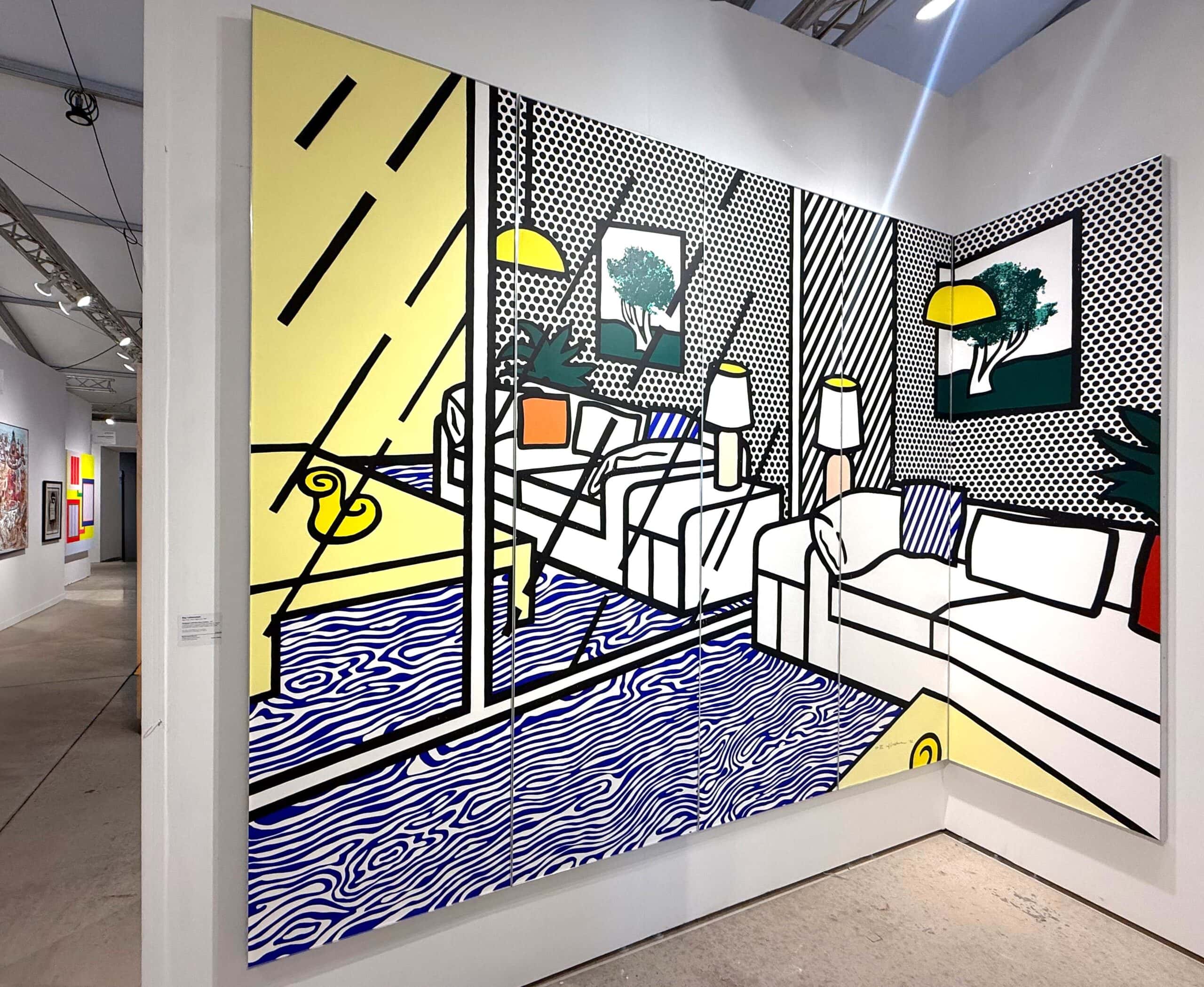
Roy Lichtenstein, Wallpaper with Blue Floor Interior, Screenprint.
The Art Deco influence appears throughout the Interiors series in both obvious and subtle ways. The geometric patterning of rugs, the streamlined silhouettes of furniture, and the bold chromatic contrasts all recall the design vocabulary of the 1920s and 1930s, even when the specific objects depicted might belong to later periods. Lichtenstein was less interested in historical accuracy than in evoking a particular mode of visual address — the confident, optimistic voice of commercial design promising transformation through acquisition. His Ben-Day dots and thick black outlines flatten and stylize this material, creating a distance that allows for critical reflection without entirely suppressing the seductive appeal of the original imagery.
By the early 1990s, Lichtenstein had been working with Pop Art imagery for three decades, and the Interiors series demonstrates both continuity with his earlier practice and a significant evolution in his concerns. Where the comic book paintings of the 1960s had focused on narrative and emotion, and the Brushstroke works had interrogated the mythology of artistic expression, the Interiors turn attention to the physical and social spaces in which art is consumed. This shift reflects the increasing importance of interior design and domestic aesthetics in contemporary art discourse, a development that Lichtenstein both anticipated and helped to shape through his ongoing investigation of the boundaries between fine art and commercial imagery.
The specific source material for the Interiors series came from furniture catalogues, decorating magazines, and commercial advertisements that Lichtenstein had collected over many years. Unlike his earlier comic book appropriations, which often reproduced specific panels with minimal alteration, the interior images underwent substantial transformation in his hands. He combined elements from multiple sources, adjusted compositions to suit his formal requirements, and introduced artworks within artworks that referenced his own previous production. The resulting images are neither straightforward appropriations nor pure inventions but synthetic constructions that maintain the generic quality of their sources while acquiring new layers of meaning through their artistic treatment.
The technical process for producing the Interiors prints was extraordinarily demanding. Working primarily with Gemini G.E.L. in Los Angeles, one of the most sophisticated print workshops in the world, Lichtenstein developed screenprint matrices that required dozens of separate colour passes and precise registration to achieve the characteristic visual effect of his mature style. The Ben-Day dots that had originated as a reference to commercial printing processes were now laboriously recreated through fine art printmaking techniques, a reversal that epitomized the conceptual wit underlying all of Lichtenstein's production. Each print in the series required extensive collaboration between the artist and master printers, with proofing sessions that could stretch over months as colour relationships and dot patterns were refined.
The furniture and objects depicted in the Interiors series were selected for their generic, almost archetypal quality. Sofas, armchairs, lamps, tables, and decorative accessories appear in configurations that evoke the idealized showroom or catalogue photograph rather than any specific actual space. This genericity is central to the series' meaning, as Lichtenstein was interested less in particular interiors than in the interior as a category — the abstract space of domestic aspiration that advertising constructs and consumers imagine inhabiting. The yellow vases, red lamps, and blue armchairs that populate these prints are not specific objects but signs of objecthood, representatives of the classes of possessions through which middle-class identity is constructed and displayed.
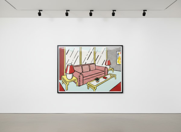
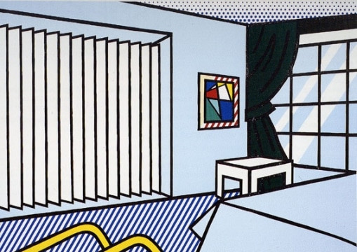
Roy Lichtenstein, Red Lamps, Screenprint. Available at Guy Hepner, New York.
Perhaps the most significant formal feature of the Interiors is their treatment of spatial depth. Lichtenstein's characteristic flattening of pictorial space is here applied to imagery that originally traded on the illusion of three-dimensionality, the photographic conventions through which furniture advertisements make objects seem tangible and rooms seem habitable. By reducing this material to flat colour fields and schematic outlines, he exposes the artificiality of the original spatial constructions while simultaneously creating a new kind of pictorial space that operates according to different principles. The interiors he depicts are impossible to enter or inhabit; they exist only as images, as patterns of colour and line that declare their own two-dimensionality even as they reference three-dimensional spaces.
Assessing quality in the Interiors series requires attention to both technical and aesthetic factors that distinguish exceptional impressions from merely acceptable examples. The complex multi-layer screenprinting process used for these works creates significant variation between impressions, and collectors should approach potential acquisitions with careful discrimination. Understanding what constitutes excellence in this series will help you build a collection that maintains value and provides lasting visual satisfaction.
The specific compositions within the series also vary in their market appeal and historical significance. Works that include representations of other Lichtenstein paintings within the depicted interior spaces attract particular collector interest for their reflexive quality, their commentary on art's role within domestic decoration. Similarly, compositions with strong colour contrasts and dynamic spatial arrangements tend to command premiums over more restrained examples. While all works in the series share the same conceptual framework, individual prints vary considerably in their visual impact and their ability to hold attention in sustained viewing.
Authentication of Lichtenstein prints follows well-established protocols centered on the catalogue raisonné compiled by Mary Lee Corlett, which documents all authorized editions with complete technical specifications including paper types, dimensions, edition sizes, and distinguishing characteristics. Any Interiors print offered for sale should carry a Corlett reference number that can be verified against published parameters. Deviations from documented specifications — incorrect dimensions, wrong paper stock, or edition numbers outside the published range — indicate either forgery or unauthorized production and should disqualify a work from serious consideration.
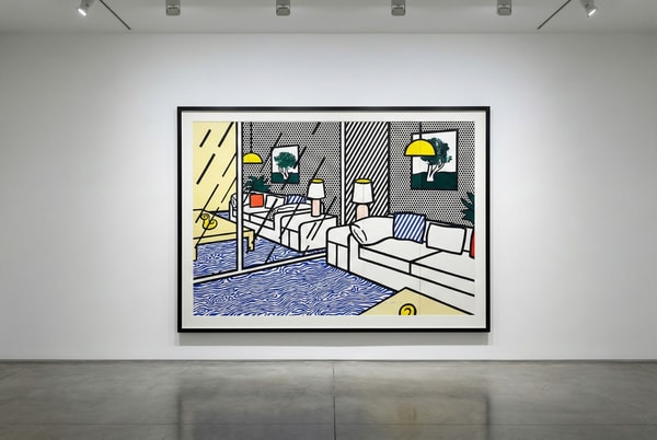
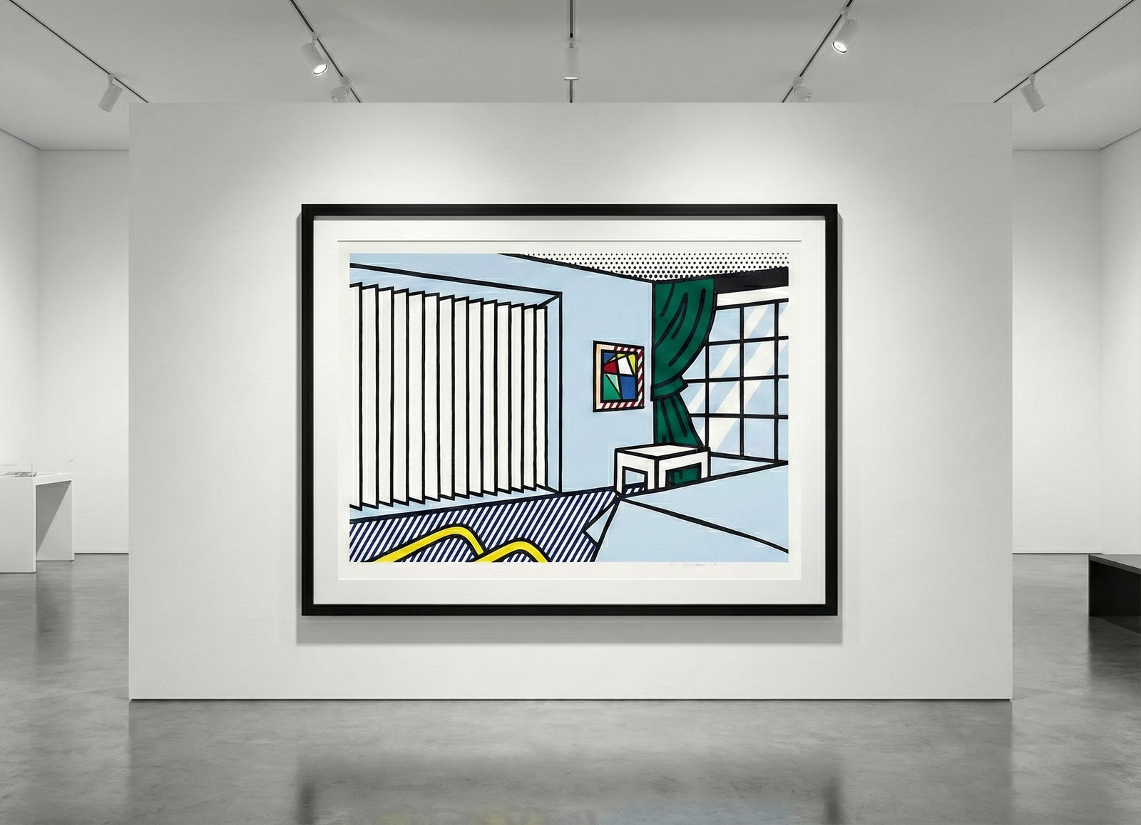
Roy Lichtenstein, Wallpaper with Blue Floor Interior, Screenprint. Available at Guy Hepner, New York.
The Roy Lichtenstein Foundation maintained authentication services until 2017, and their records remain the authoritative source for verification of disputed works. For prints with complete documentation and clear provenance, Foundation authentication may not be necessary, but works with gaps in ownership history or questions about their production circumstances may require additional verification. The Foundation's archives are now held by institutions that can provide research assistance for authentication purposes, though formal opinions are no longer issued.
Provenance documentation for Interiors prints should ideally trace ownership from the original publisher to the current holder, with each transfer supported by invoices, certificates of authenticity, or comparable records. The primary publisher for most works in the series was Gemini G.E.L., whose records are exceptionally well-maintained and can verify edition impressions through their own documentation systems. Works that passed through major auction houses (Christie's, Sotheby's, Phillips) will have catalogue entries that serve as provenance markers, while gallery sales should be documented through invoices or certificates that establish the transaction date and parties involved.
The Interiors series comprises multiple distinct images, each produced in limited editions with varying structures depending on the specific work and its publication circumstances. Most prints in the series were published by Gemini G.E.L. in editions ranging from approximately 40 to 60 impressions plus artist's proofs, printer's proofs, and other documented variants. Understanding these edition structures helps collectors evaluate relative scarcity and appropriate pricing for specific works.
The standard edition impressions, numbered in Arabic numerals (for example, 23/50), represent the primary market for collectors. Artist's proofs, typically numbered in Roman numerals and constituting 10-15% of the total print run, were retained by Lichtenstein for personal use or special gifts and may carry modest premiums due to their association with the artist's own collection. Printer's proofs, Bon à Tirer proofs (the approved proof against which all edition impressions were compared), and other working proofs occasionally appear on the market but are generally considered outside the standard collector market and require specialized evaluation.
Current availability of Interiors prints reflects their status as mature secondary market works by a canonical Pop Art figure. Unlike recently published editions that may still be available from the original publisher, all Interiors prints circulate exclusively through the secondary market — auction houses, private dealers, and collectors disposing of holdings. This means that availability depends on current holders' willingness to sell, which fluctuates according to market conditions, tax considerations, and personal circumstances. At any given time, only a fraction of the edition for any particular Composition will be available for purchase, and collectors seeking specific works may need to monitor the market over extended periods.
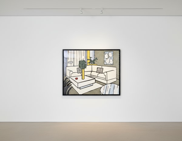
Roy Lichtenstein, Yellow Vase, Available at Guy Hepner, New York.
The Interiors series has attracted increasing institutional and collector attention over the past decade as the full scope of Lichtenstein's late-career production has been critically reassessed. Where earlier scholarship and market focus concentrated on the iconic 1960s works, recent exhibitions and publications have examined the sophisticated conceptual extensions represented by series like the Interiors, Reflections, and Perfect Paintings. This critical revaluation has driven demand for high-quality examples from these later series, and availability has tightened accordingly. Collectors who waited for market opportunities in the 2000s and 2010s have absorbed much of the available supply, and current holders show less inclination to sell than in earlier periods.
Pricing for Interiors prints reflects their position within the broader Lichtenstein market and the specific characteristics of individual works. The series occupies a middle tier within Lichtenstein's print production — more expensive than minor graphic works and multiples but less costly than the most iconic 1960s images or unique works on paper. This positioning makes the Interiors accessible to serious collectors while maintaining the quality and significance expected of blue-chip contemporary prints.
Several factors influence pricing within the series:
The Interiors series has demonstrated steady appreciation over the past two decades, with prices rising from low five figures for standard impressions in the early 2000s to current levels that reflect both inflation and genuine revaluation of the series' importance. This appreciation curve has been smoother than the more volatile pricing for Lichtenstein's most famous images, which experienced sharper peaks and corrections during market cycles. For collectors seeking Lichtenstein exposure with relative value stability, the Interiors offer an attractive combination of significance and reasonable pricing.
Compared to other late-career series, the Interiors occupy a distinctive market niche. The Reflections prints, with their explicit quotation of earlier Lichtenstein images, tend to trade at premiums that reflect their art-historical self-consciousness. The Perfect Paintings and Brushstrokes continue the interrogation of artistic gesture that began in the 1960s. The Interiors, by contrast, extend Lichtenstein's engagement with commercial imagery into new territory — the domestic interior as site of consumption and display — and their market position reflects this conceptual distinctiveness. Collectors specifically interested in Pop Art's relationship to design and decoration often prioritize the Interiors over other late series.
The Interiors prints present particular opportunities and challenges for domestic installation that collectors should consider before acquisition. Their subject matter — idealized living spaces — creates an inherent dialogue with any actual room in which they are displayed, and thoughtful placement can activate this reflexive dimension in rewarding ways. A Lichtenstein interior hanging in your interior comments on both the depicted space and the physical space it occupies, collapsing the distinction between art and decoration that the series interrogates.
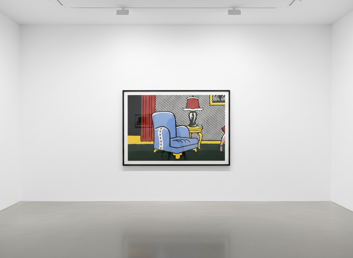
Roy Lichtenstein, La Sortie, from Interiors, 1990-91, Screenprint. Available at Guy Hepner, New York.
The large format of many Interiors prints (some exceeding 60 inches in their longest dimension) requires substantial wall space and careful consideration of viewing distance. These works are designed to be encountered at a moderate distance that allows the overall composition to register while remaining close enough for the Ben-Day dots to be visible as distinct elements. Hanging them in spaces too small for proper viewing distance diminishes their impact, while excessively large rooms may require grouping with other works to maintain visual presence. The bold colours and graphic clarity of the Interiors also demand attention to surrounding elements — they can dominate rooms with subtle decoration or clash with competing visual intensity.
Conservation requirements for the Interiors prints centre on light protection and climate control. The screenprint inks used in these works are susceptible to UV degradation, and extended exposure to direct sunlight or strong artificial light will cause colour shifting that compromises the precise chromatic relationships essential to the series' visual effect. Museum-quality UV-filtering glazing is mandatory for any displayed Interiors print, and collectors should also consider light levels in the display space. Climate stability — avoiding dramatic fluctuations in temperature and humidity — protects the paper substrate from dimensional changes that can cause cockling, warping, or surface cracking.
Framing choices for Interiors prints should respect the works' graphic character while providing adequate protection. The series was conceived for framing, and Lichtenstein approved frame specifications that complement the visual effect of the imagery. Simple profiles in neutral colours (black, white, or natural wood) typically work best, allowing the print's own colours to dominate without competition from elaborate frame mouldings. Float mounting, which displays the full sheet including margins and signature, is generally preferable to window matting for works in good condition, as it presents the print as a complete object rather than a cropped image.
The Interiors series occupies a significant position within both Lichtenstein's individual development and the broader trajectory of late twentieth-century printmaking. Coming near the end of a career that had fundamentally reshaped understanding of the relationship between fine art and commercial imagery, the series represents a mature synthesis of concerns that Lichtenstein had explored across multiple decades. The furniture advertisements and decorating imagery that served as source material connected his late work to the consumer culture investigations of the 1960s while extending those investigations into new conceptual territory.
Art historians have increasingly recognized the Interiors as among Lichtenstein's most theoretically sophisticated productions. The series' reflexive dimension — its inclusion of art within depicted interiors, its acknowledgment of its own eventual status as decoration — anticipates and participates in critical discussions about the social function of art that would become central to institutional critique and relational aesthetics in subsequent decades. By making the domestic interior itself his subject, Lichtenstein positioned his work at the intersection of art, design, and commerce in ways that remain relevant to contemporary debates about these categories.
The technical achievement of the Interiors prints also deserves recognition. Working with Gemini G.E.L., Lichtenstein pushed the possibilities of screenprinting to extraordinary refinement, achieving colour relationships and dot patterns that rival or exceed any prints produced in the medium. The series demonstrates that printmaking, far from being a minor adjunct to painting, could serve as a primary vehicle for artistic statement at the highest level. This lesson has influenced subsequent generations of artists who approach printmaking with ambitions comparable to those they bring to other media.
For collectors, the art historical significance of the Interiors provides both intellectual satisfaction and practical value protection. Works that occupy secure positions within canonical narratives tend to maintain market standing across economic cycles, as institutional interest provides a floor beneath collector demand. The Interiors series, with its clear relationship to Lichtenstein's earlier Pop investigations and its anticipation of later critical concerns, benefits from this kind of art historical anchoring. Acquiring prints from this series means participating in a conversation that extends well beyond the contemporary market into lasting discussions about the nature and function of art.
Guy Hepner Gallery maintains one of the most comprehensive offerings of Roy Lichtenstein prints available through any single source, with particular strength in the Interiors series and related late-career work. Our position in the New York market provides access to deaccessions from major collections, private treaty sales, and works consigned by long-term holders seeking discrete placement with qualified buyers. For collectors seeking specific compositions from the Interiors series, we can often source works that are not publicly listed through our network of private collectors and institutional contacts.
The acquisition process at Guy Hepner begins with consultation to understand your collecting objectives, display requirements, and budget parameters. For the Interiors series specifically, we can advise on which compositions best suit your interests — whether you prioritize the reflexive works with paintings within paintings, the most visually dynamic compositions, or particular colour relationships that complement existing collections or interior schemes. Our staff includes specialists in Lichtenstein's print production who can explain technical aspects of the screenprinting process and help you evaluate condition and quality in works under consideration.
All Interiors prints offered through Guy Hepner carry full documentation including catalogue raisonné references, condition reports prepared by our conservation staff, and provenance records tracing ownership history. We guarantee authenticity and stand behind every work we sell with our reputation as one of New York's leading dealers in post-war and contemporary prints. For significant acquisitions, we can arrange viewing appointments at our gallery at 529 West 20th Street in New York, where works can be examined in controlled lighting conditions that reveal their full quality.
Whether you are building a focused Lichtenstein collection, seeking a single important work to anchor a broader holdings of Pop Art prints, or exploring the intersection of art and design through the Interiors series specifically, Guy Hepner offers the expertise, inventory access, and professional service that serious collectors require. Contact our gallery to discuss current availability and begin the conversation about adding an Interiors print to your collection.
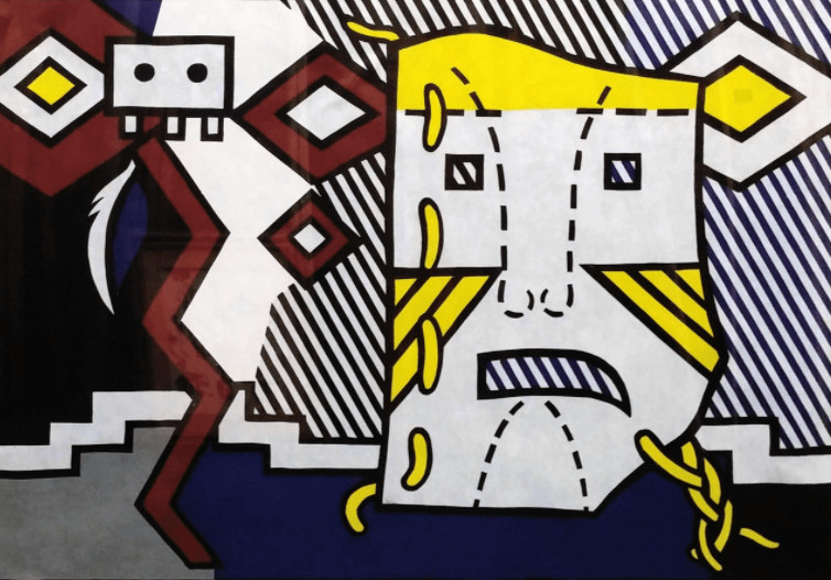
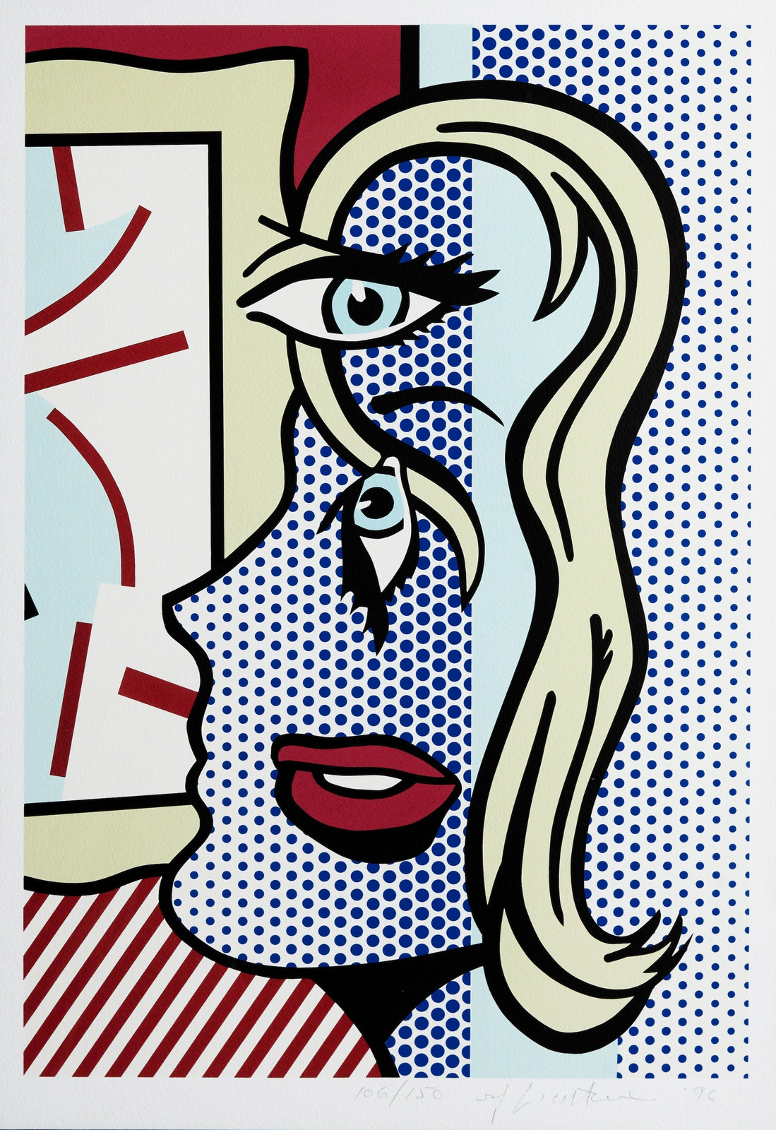
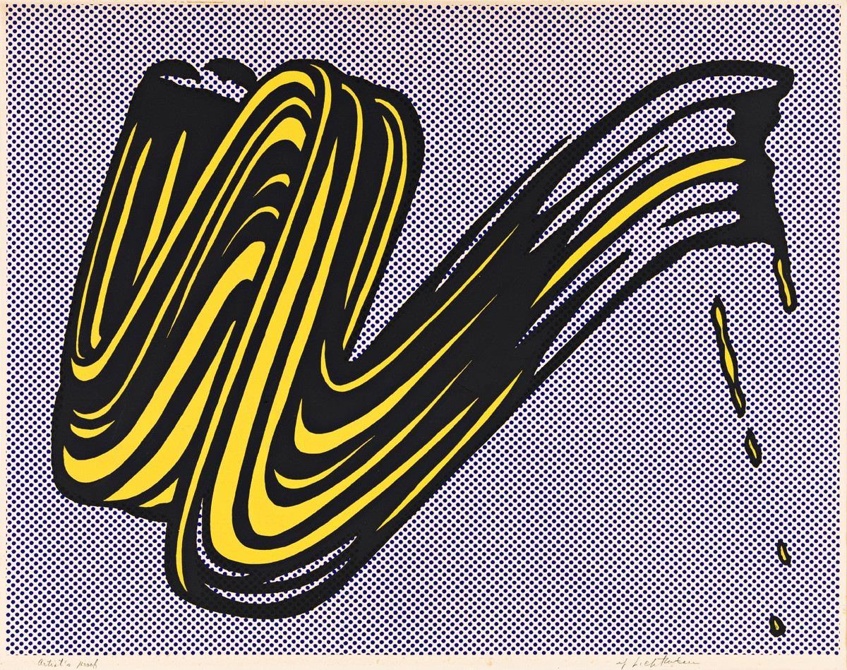
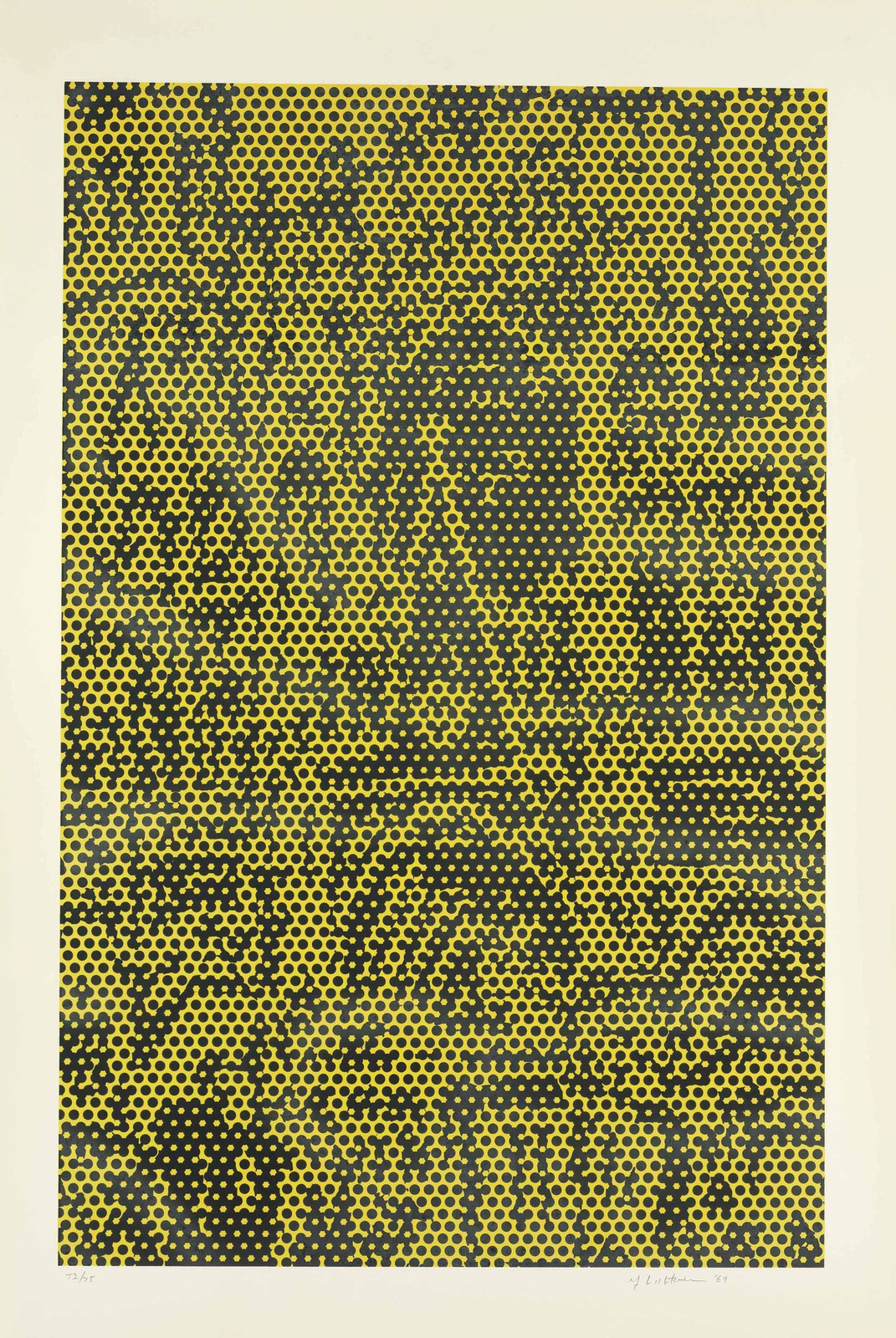
Explore Roy Lichtenstein prints for sale at Guy Hepner: Interiors, American Indian Theme, Art Critic, Brushstrokes, Cathedral.
Related Series