Paintings
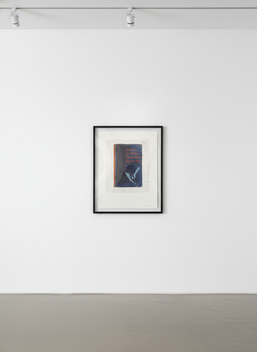
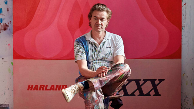
Harland Miller was born in 1964 in Yorkshire, a fact that matters more than it might initially appear. Yorkshire shaped his register: wry, dry, resistant to sentimentality, alive to the comedy of failing with a certain composure. Before his paintings achieved their current renown, Miller was known — to those who knew him at all — as a novelist. His 2000 debut, Slow Down Arthur, Stick to Thirty, was published to genuine critical notice and placed him in the lineage of English fiction that takes language seriously while refusing to take itself too seriously.
Understanding Miller as a writer is not incidental to understanding his paintings. It is essential. The titles he gives his invented Penguin paperbacks are not captions applied after the visual image is resolved; they are the primary event. The painting is the container; the title is the payload. Miller works as a writer who paints, and the paintings only make full sense when you hold both activities simultaneously in mind.
He is represented by White Cube, which has shown his work in London, New York, and Hong Kong. His prints are produced in collaboration with his gallery and published in carefully controlled editions. In the past decade he has moved from a figure known primarily in the British art world to an artist with a genuinely international collector base and a market that continues to strengthen.
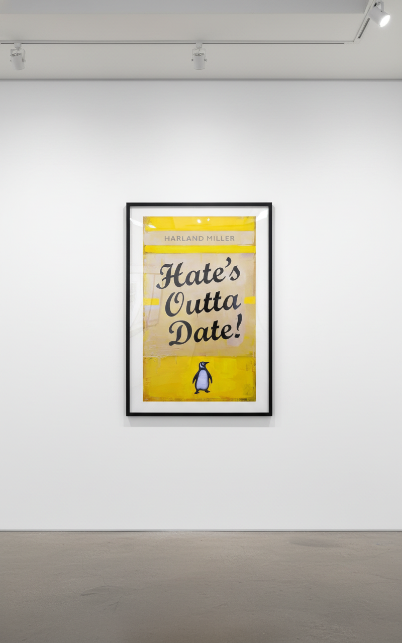
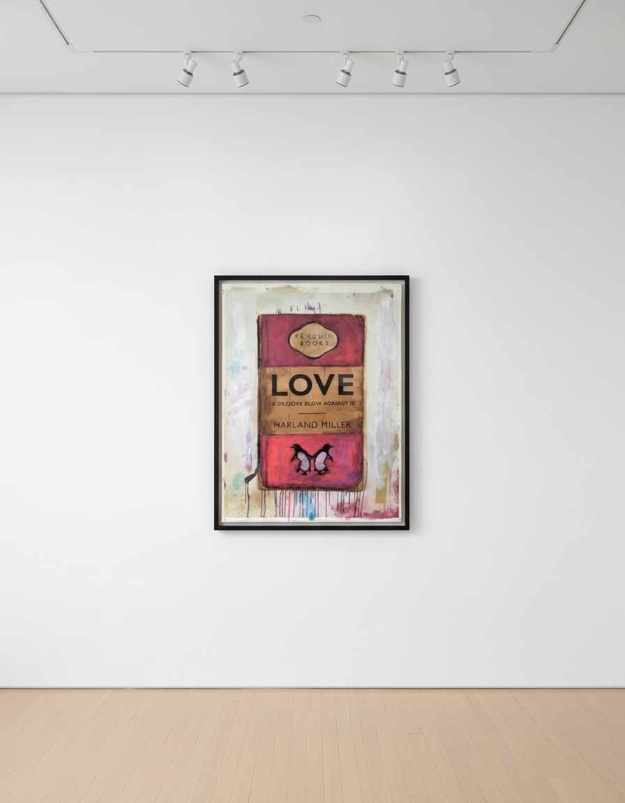
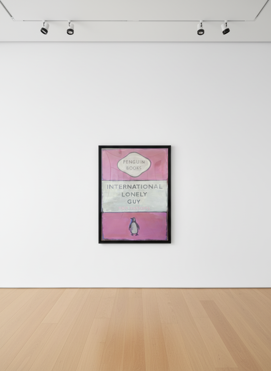
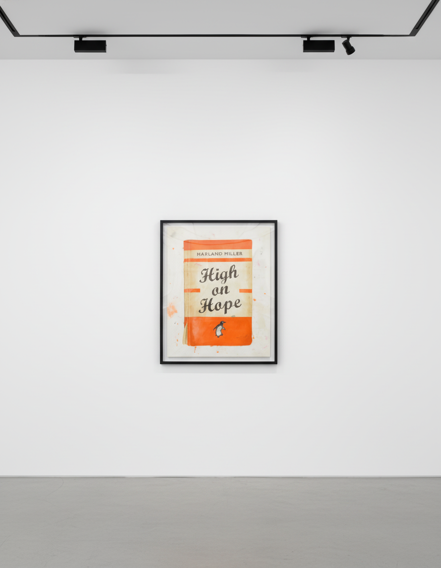
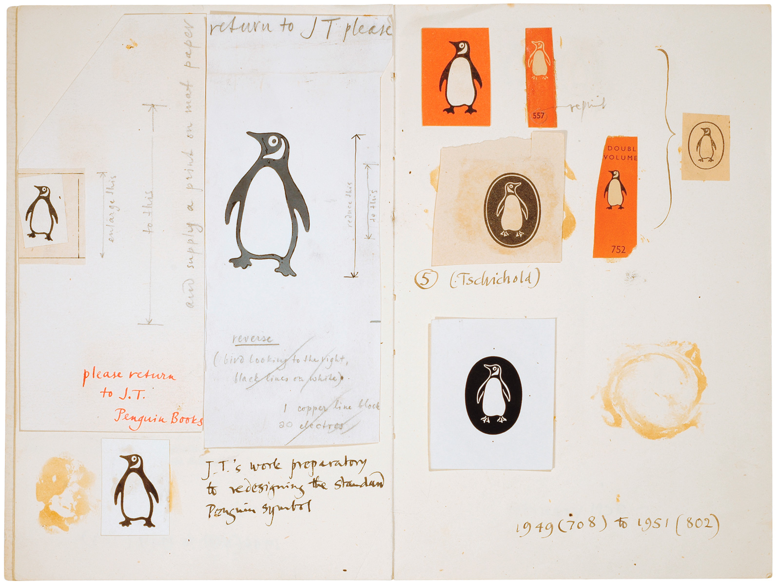
Young's template was elegant in its simplicity: a tripartite horizontal layout, Gill Sans typography throughout, and a colour-coding system by genre. Orange for general fiction. Green for crime and mystery. Blue for biography. Red for travel. The penguin colophon in the lower right. The author's name in the upper third; the title, large, in the central band; the imprint at the foot.
This became one of the most recognised pieces of British graphic design of the twentieth century. It carried with it the specific cultural weight of serious-but-accessible reading — of the commuter, the student, the educated general reader who wanted literature without pretension, knowledge without ceremony. Penguin paperbacks were not luxury objects. They were the democratisation of the literary culture.
Miller reproduces this template with meticulous fidelity, then scales it to monumental canvas dimensions. He works back into the surface with gestural marks, drips, and physical texture — the worn, weathered, much-handled quality of a book that has been read and re-read and left face-down on too many beaches. At painting scale, the familiar template becomes strange. The typography that looked modest on a ten-pence paperback becomes a billboard. The genre-colour coding that organised a bookshop becomes an art-historical reference. The humble vessel of cheap literary fiction becomes the subject of serious painting.
But then the work begins. The titles are wrong in ways that are immediately apparent and slowly unfold. The painterly surface — the physical texture, the gestural marks, the evidence of making — declares clearly that these are not reproductions of book covers. They are paintings that use book covers as their grammar, their syntax, their shared vocabulary with the viewer.
The brilliance of the format is that it gives Miller everything he needs: an instantly legible visual structure that any literate Anglophone viewer can read; a set of associations (literary, democratic, unpretentious, slightly nostalgic) that he can work with and against; and a deadpan container for titles that, in another context, might read as confessional or sentimental but here are protected by the formality of the Penguin template.
The irony is structural. But it is not cold. The works are genuinely funny, and they are genuinely consoling, and those two things coexist in ways that more programmatically ironic artists cannot manage.
Miller's print editions are produced in collaboration with White Cube and follow a tiered structure that collectors need to understand clearly.
Miller's career has moved through a recognisable arc: from early critical notice in the British art world, through significant White Cube shows in London, to international institutional attention and his current blue-chip standing.
His White Cube exhibitions — in Bermondsey, in Mason's Yard, in New York and Hong Kong — have been the primary venues for introducing new work. Each major show has tended to consolidate his critical standing and tighten available supply at the gallery level.
The Tate Collection holds Miller works, a fact that matters to collectors as a signal of institutional validation. Works in public collections tend to anchor the market for an artist's output more broadly — they confirm a permanent conversation with the institution rather than a temporary one with the market.
The critical reception arc has been unusually clean for an artist at Miller's level: early recognition, steady deepening of serious critical engagement, international crossover without the loss of critical credibility that sometimes accompanies it. This arc is one of the factors that has made his secondary market unusually stable.
The past decade has seen consistent price appreciation for Miller's signed print editions, with the most significant movement in the White Cube large-format editions. Several factors drive this:
The rise of text-based art as a collectible category has lifted all major practitioners. Christopher Wool, Barbara Kruger, Ed Ruscha — the canonical text-based artists — have seen significant market expansion. Miller occupies a distinct position within that broader category: more literary, more specifically English in register, with a format that is immediately legible rather than requiring an art-world frame for comprehension.
Edition discipline has protected values. Miller and White Cube have maintained tight control over edition sizes. The secondary market has not been flooded with competing supply.
Literary crossover brings collectors from adjacent markets. Miller's novels, and his reputation as a writer, mean his collector base extends beyond pure art collectors into literary and design-world audiences. This broadened base of demand supports stable pricing.
Institutional acquisitions signal long-term cultural validation. The Tate holdings, alongside international institutional acquisitions, confirm that the work is being taken seriously in a context that outlasts market cycles.
What makes Harland Miller's prints valuable? The combination of limited edition discipline, consistent critical recognition, institutional validation, and the singular quality of the work itself. Miller has produced a coherent, recognisable body of work with genuine intellectual content — a rarity in the edition print market.
Are Miller prints a good investment? The signed White Cube editions have demonstrated consistent price appreciation over the past decade. Standard signed editions have shown stable to moderate appreciation. No art purchase is a financial guarantee, but Miller's market fundamentals — tight supply, strong demand, institutional support — are as sound as the edition print market offers.
How do I distinguish authentic editions? Authentic editions carry a certificate of authenticity from White Cube, with edition number, title, and medium specified. Works should also carry a blind embossed stamp or plate signature confirmation. Verify edition numbers against known published edition sizes.
What is the difference between White Cube editions and standard editions? White Cube large-format editions are produced in smaller edition sizes at larger dimensions, and carry the gallery's full authentication. Standard editions may be produced through other publishers or in larger edition sizes. Both are authentic Miller works when properly documented; the White Cube large-format editions represent the top of the print tier.
Where can I see Miller's work in New York? White Cube New York (1002 Madison Avenue) represents Miller and holds inventory. Major auction house sales — Christie's, Sotheby's, Phillips — regularly include Miller works in their contemporary prints and editions sales.
How many editions does Miller produce per print? Edition sizes vary by publication. White Cube large-format editions: typically 15–25. Standard signed editions: 50–150. Specific edition information should be confirmed against the individual COA.
Browse Harland Miller prints at Guy Hepner | Sell your Harland Miller
Explore Harland Miller prints for sale at Guy Hepner: Penguin Book Cover Editions, Screenprints & Editions, Works on Paper.
Related Series