Andy Mouse
June 15, 2026
Keith Haring is one of the most recognisable artists of the twentieth century. His bold lines, radiant babies and dancing figures have become a visual language shared across cultures, continents and generations — instantly legible whether printed on a gallery wall in New York, stencilled onto a street in Tokyo, or worn on a T-shirt by someone who has never set foot in a museum. Since his death in 1990 at the age of thirty-one, Haring's work has only grown in cultural authority: his prints trade at auction for hundreds of thousands of dollars, major retrospectives continue to draw record crowds, and his foundation remains one of the most active in contemporary art philanthropy. To understand Keith Haring is to understand something essential about how art can refuse the boundaries placed around it — and why that refusal still matters.
For collectors, Keith Haring artwork — specifically, the print editions produced during his lifetime in close collaboration with master printers — represents the most accessible and historically significant entry point into his market. The screenprint portfolios, from the raw energy of Bad Boys (1986) to the valedictory grandeur of The Blueprint Drawings (1990), are catalogued in the definitive Littmann catalogue raisonné and authenticated by the Keith Haring Foundation. Whether you are drawn to the political charge of the Apocalypse">Apocalypse collaboration with William Burroughs, the street-art vernacular of the Pop Shop editions, or the luminous spirituality of Icons, the range and consistency of Haring's printed output is extraordinary for an artist who lived such a brief and blazing life. The questions of what to buy, what to look for, and why Haring's market continues to perform so strongly are ones this guide addresses in full.
Keith Haring, Pop Shop Iii (A) (Littmann PP. 144), 1989. Screenprint. Available at Guy Hepner, 177 Tenth Avenue, New York. Browse Keith Haring Pop Shop III Prints →
This guide covers Keith Haring's biography from his Pennsylvania childhood to his death in New York in 1990, his visual vocabulary, his relationships with Andy Warhol and Jean-Michel Basquiat, his activism, his major print series, and everything a first-time or experienced collector needs to know before acquiring a work.
Inquire About Available Keith Haring Prints
Browse available Keith Haring editions at Guy Hepner, 177 Tenth Avenue, New York.
Keith Allen Haring was born on 4 May 1958 in Reading, Pennsylvania, the eldest of four children in a close-knit middle-class family. His father, Allen Haring, was an amateur cartoonist who drew for pleasure rather than profession, and from an early age Keith absorbed the visual grammar of comic strips, newspaper cartoons and Walt Disney animation. The two of them filled notebooks together — an informal apprenticeship in line-making that would prove foundational. Keith's earliest drawings show a precocious instinct not for photographic likeness but for essence distilled into a handful of strokes, the same compression that would define his mature work.
Reading in the 1960s and 1970s was a mid-sized industrial city navigating long economic decline, but Haring's childhood was not defined by deprivation. He was, by his own account, a happy child who drew constantly. What he lacked was an environment that could match the ambition and the hunger he felt building from adolescence onward. He enrolled briefly at the Ivy School of Professional Art in Pittsburgh in 1976, intending to study commercial illustration — the discipline his father's example had pointed him toward — before concluding that technical training in commercial art was not what he needed. He wanted something rawer, more urgent, and more connected to the culture he was beginning to discover through music, literature and the radical art movements filtering out of New York.
In 1978, aged twenty, Haring moved to New York City and enrolled at the School of Visual Arts (SVA) on East 23rd Street in Manhattan — a decision that would reshape his life and, through him, reshape the history of late twentieth-century art. The New York he arrived in was electric with creative possibility and social danger simultaneously. The city was emerging from near-bankruptcy, its streets rough and its institutions strained, but the friction generated by poverty, energy and ambition produced extraordinary culture. The Lower East Side and downtown Manhattan were home to punk music, No Wave cinema, graffiti writing, performance art and a generation of artists who were determined to tear down every boundary between high and low, gallery and street, art and life.
Haring devoured it all. He moved through the circles forming around clubs like the Mudd Club and Club 57, where he would meet artists, musicians, writers and the figures who would shape the next decade of his life. It was here that he encountered Jean-Michel Basquiat — then tagging SAMO© across lower Manhattan — and began to absorb the example of Andy Warhol, whose strategy of fame-as-medium and whose insistence that popularity was a legitimate artistic tool would prove decisive for Haring's own development. The Times Square Show of 1980, a chaotic, unauthorised group exhibition staged in a former massage parlour at 41st Street and Seventh Avenue, announced the arrival of a new sensibility that refused the clean white walls of the uptown galleries. Keith Haring was part of it from the beginning.
In 1980, Haring discovered a material and a venue that changed everything: the blank black paper panels used to cover expired advertising spaces in New York City subway stations. Working with white chalk on this ready-made surface, he began drawing in the stations — quickly, in full public view, between trains. The conditions were everything: the time pressure of approaching trains, the audience of commuters who had not chosen to encounter art, the harsh fluorescent light, the roar and rush of the underground. Haring was not decorating the subway. He was using it as a gallery, a publishing house and a performance space simultaneously, three years before those functions would be recognised as intentional artistic strategies.
The Keith Haring subway drawings introduced the core cast of his visual vocabulary to a mass audience. The crawling radiant baby appeared early, outlined in bold chalk lines with a halo of radiating marks suggesting light or energy. The barking dog emerged — tense, angular, its lines radiating outward like shockwaves of aggression. Dancing human figures, genderless and archetypal, twisted and leapt across the black paper. Pyramids, flying saucers, television sets and intertwined bodies followed, accumulating into a consistent language that commuters began to recognise and look for. Haring estimated that he completed over five thousand subway drawings between 1980 and 1985, spread across hundreds of stations throughout the New York transit system.
The radical act was not simply the act of drawing in a public space — graffiti writers had been doing that for a decade, with greater physical risk — but the specific refusal of the gatekeeping function that separates art from everyday life. Anyone who rode the New York subway could encounter a Haring. You did not need to know his name, own a gallery membership, or buy a ticket to a museum. The work was freely given, democratically distributed, and it built an audience of millions before Haring had his first solo gallery exhibition. When he was arrested for criminal mischief in 1982, charged with defacing public property with chalk drawings, the arrest itself became a kind of proof of the work's power: the city felt sufficiently threatened by images on black paper to handcuff their maker.
The transition to the commercial gallery was not a retreat from these principles but an extension of them. Tony Shafrazi — who had famously spray-painted Picasso's Guernica with the words "KILL LIES ALL" in 1974, an act that had cost him his position at the Museum of Modern Art but had established his credentials as a boundary-crossing provocateur — became Haring's dealer in 1982 and gave him his first solo exhibition. The show sold out. Haring was included in the 1982 Documenta 7 in Kassel and the 1984 Whitney Biennial. By the mid-1980s, Keith Haring art was being shown in Amsterdam, Tokyo, São Paulo and Sydney. The subway had been the launch pad; the gallery world was simply the next surface to draw on. Keith Haring artwork, once dismissed as vandalism, was now the subject of international critical attention and substantial commercial demand.
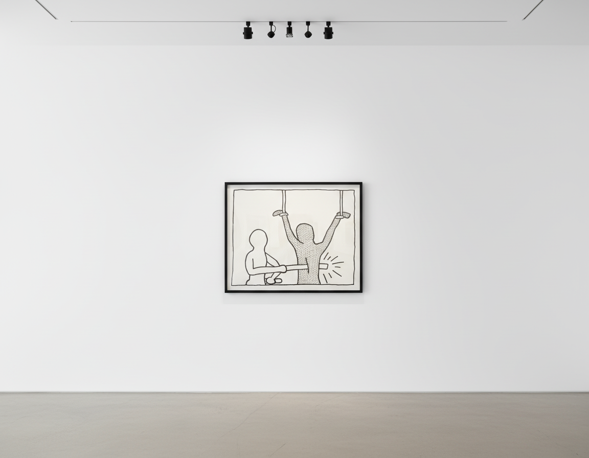
To stand in front of a Keith Haring print is to encounter a system of meaning so compressed that it operates almost like a language. The symbols are simple enough to be reproduced by a child — this was intentional — but they carry specific freight that Haring developed over years of use and refinement, and their meaning shifts depending on context, combination and scale. Understanding the vocabulary is the first step toward understanding the work at a depth beyond surface recognition.
The radiant baby is perhaps Haring's most enduring and universally legible symbol. Depicted as a crawling infant outlined in bold black lines with a halo of radiating marks suggesting light or energy, it represents innocence, potential and the vulnerability of new life in a world full of threat. Haring returned to it obsessively from 1980 until the end of his life, and it appeared in some of his most politically charged imagery — holding an atomic symbol, being menaced by a barking dog, ascending into the light. The baby is always positive in its fundamental nature, even when the surrounding imagery is sinister: it is what must be protected, what is at stake.
The barking dog is the radiant baby's dark counterpart: a rigid, angular animal bristling with aggression, its mouth open, its entire posture confrontational. For Haring it represented authority, coercion and the state's capacity for violence — but also the aggression inherent in human nature more broadly. The dog is never cute. Its lines are taut, and the radiating marks around it suggest not warmth but threat made visible. In Haring's political works, the barking dog often functions as a stand-in for institutional power: police, government, the structures that control and contain.
The dancing figure — the generic Haring human, recognisable from thousands of reproductions, T-shirts and street murals — is a body in motion, usually genderless, capable of registering joy, pain, ecstasy or terror depending on the context in which it appears. These figures appear singly and in vast interlocking chains, their bodies connecting to form patterns that suggest simultaneously community and entrapment, celebration and compulsion. Haring was explicit that the dancing figure was fundamentally celebratory: "It's about joy," he said, "but it's also about the body's power to express what words cannot."
Beyond these three anchors, Haring's pictographic lexicon includes a crawling figure (menace, surveillance, submission), a Pyramid (timeless and often oppressive power structures), a television set (mass-media control, the replacement of experience with image), a flying saucer (the alien, the other, transcendence and utopian possibility), and various animals including dolphins, serpents and creatures of his own invention. What makes Haring's symbols distinctive is not any single image but the way they interact. A radiant baby threatened by a barking dog in front of a glowing television set produces a statement as legible as a sentence. Haring had created, in effect, a portable visual language — one that could be recombined endlessly to generate new meanings across new contexts, from subway walls to gallery prints to activist posters distributed at demonstrations. This capacity for recombination is what gives his work its extraordinary reach and what makes his print series so rich in meaning even at close and repeated study.
The influence of this visual language on subsequent artists and designers can scarcely be overstated. The principle that a small vocabulary of boldly outlined symbols, clearly differentiated and consistently applied, could generate infinite compositional and semantic variety has been absorbed into graphic design, street art and animation in ways that rarely acknowledge Haring directly but owe him a substantial debt.
Keith Haring, Angel, from Icons (Littmann PP. 171), 1990. Screenprint. Available at Guy Hepner, 177 Tenth Avenue, New York. Browse Keith Haring Icons Prints at Guy Hepner →
Andy Warhol and Keith Haring were unlikely allies separated by nearly three decades. Warhol was a product of the 1950s commercial art world who had invented American Pop Art in the early 1960s and spent the intervening decades systematically expanding the definition of celebrity, commerce and art until the boundaries between them dissolved entirely. Haring was a child of 1970s Pennsylvania who had arrived in New York with a backpack and a conviction that art belonged in the streets, not the drawing rooms of collectors. And yet the two men recognised in each other something essential: a shared belief that popularity was not the enemy of seriousness, and that the most radical thing an artist could do was to be genuinely, unashamedly available to as wide an audience as possible.
Haring met Warhol in 1982 and the two became close friends, mutual admirers and a productive foil for each other's public presence. Warhol attended Haring's exhibition openings; Haring visited the Factory and appeared in Warhol's social orbit. The pair appeared together in photographs, at events, and eventually in each other's work — Warhol made a portrait of Haring; Haring made a portrait of Warhol. Each recognised in the other a working model for how an artist could move fluidly between the street, the gallery and the market without losing integrity or compromising the fundamental conviction that drove the work. Warhol's sudden death in February 1987, from complications following routine surgery, devastated Haring in ways he recorded privately in his journals and publicly in the works that followed.
Jean-Michel Basquiat was closer in age and immediate origin. The two had been part of the same downtown creative scene since around 1980, when Basquiat's SAMO© tags were appearing on the same Lower East Side walls where Haring's flyers and chalk drawings were being produced. Their friendship was warm but also competitive in the way that only two artists of extraordinary ambition operating in the same small world can be. Where Basquiat painted, Haring drew; where Basquiat's imagery was tortured, historically weighted and autobiographically specific, Haring's was more archetypal, universalist and deliberately accessible. The differences were productive rather than divisive. Haring also forged a significant collaborative relationship with LA II — Angel Ortiz, a teenage graffiti writer from the Lower East Side — whose intricate, dense tag style Haring incorporated into a series of collaborative works that deliberately blurred the boundary between street writing and gallery painting.
The broader context of the 1980s art world was one of extraordinary commercial expansion and fierce critical controversy. Neo-Expressionism — the decade's dominant mode, characterised by a return to figurative painting, emotional directness and marketable personality — was making millionaires of artists who had been unknown three or four years earlier. Haring was simultaneously part of this world and critical of it. He showed at the most prestigious galleries and participated in the international art-fair circuit, but he also maintained the Pop Shop, gave artwork away freely for activist causes, and consistently insisted that the commercial success of his work was not its measure or its point. Major museum exhibitions — the Stedelijk Museum in Amsterdam in 1986, a retrospective at the San Francisco Museum of Modern Art — confirmed his institutional standing while the subway drawings' audience had already confirmed something more important and more durable: a mass public that encountered his work without institutional mediation and cared deeply about what they found.
Haring's art was never politically neutral — the symbols of control, liberation and threat were baked into his visual language from the earliest subway drawings — but from 1985 onward it became explicitly activist in ways that connected his imagery directly to the defining social crises of the decade. The first major political gesture had come with the Free South Africa poster of 1985: a bold screenprint in primary colours depicting two figures with a third breaking free of chains, distributed freely at demonstrations and through anti-apartheid activist networks. The image was reproduced millions of times in the years before apartheid's end. Haring charged nothing for political use of his imagery. The work was not sold; it was deployed.
In 1986, Haring painted the Crack is Wack mural on a handball court wall at 128th Street and Second Avenue in East Harlem — a vivid, roughly ninety-foot-long image depicting the physical and social devastation of the crack cocaine epidemic that was tearing through New York's poorest communities. The mural was technically illegal when first painted; the city later designated it a landmark and it has been restored multiple times. That same year, the Bad Boys series of six large screenprints was published, its imagery drawing on the street-art vernacular of New York's graffiti writers and expressing a coded but unmistakable queer sexuality at a moment when queer identity was still dangerous, still a target of legal persecution and social violence.
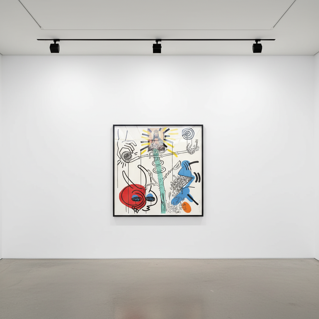
In 1988, Haring was diagnosed as HIV-positive. He told his diagnosis to close friends but did not make a public announcement until 1989. The effect on his work was immediate and profound: a greater urgency, a willingness to confront mortality and the body's vulnerability more directly, a compression of meaning that gives the late prints and paintings their particular weight. He created work for ACT UP — the AIDS Coalition to Unleash Power — and contributed to the "Silence = Death" campaign, which appropriated the pink triangle of Nazi persecution and demanded action on the AIDS crisis at a moment when the United States government's silence was costing tens of thousands of lives. Haring's visual language was perfectly adapted to activist imagery because it operated at the level of archetype rather than illustration: a Haring poster did not need a caption because the visual argument was complete in itself, and it could cross language barriers and educational levels with equal facility. In the age of AIDS, this accessibility was not a stylistic choice. It was a political necessity.
Keith Haring, Bad Boys 1 (Littmann PP. 57), 1986. Screenprint. Available at Guy Hepner, 177 Tenth Avenue, New York. Browse Keith Haring Bad Boys Prints at Guy Hepner →
In April 1986, Haring opened the Pop Shop at 292 Lafayette Street in SoHo, New York — a retail space selling T-shirts, posters, magnets, keychains, buttons and other merchandise printed with his imagery at accessible price points. The philosophy was explicit and unapologetic: Keith Haring art, or something closely derived from it, should be available to anyone who wanted it, not only to those who could afford gallery prices or who had access to the cultural institutions that typically mediate between art and the public. The Pop Shop was a business, a statement, a provocation and an extension of the same democratic impulse that had driven the subway drawings. You could walk in off the street and leave with something. That was the point.
Critical reception was hostile from sections of the art world that felt the Pop Shop blurred the boundary between Haring's gallery practice and mass-market licensing — that it debased the currency of his work by making it too easy to acquire, too widely available, too visibly commercial. Haring's response was to refuse the premise of the criticism. Andy Warhol had made the same argument twenty years earlier with his Factory output and his Warhol Enterprises business model: the boundary between art and commerce was a convention maintained by institutions that benefited from artificial scarcity, and it deserved no special reverence. "I wanted to create a place that was anti-exclusive," Haring said, "where people could come in, be comfortable, and find something they could afford." The Pop Shop was not a compromise; it was a principle made physical.
The Keith Haring Pop Shop print series — Pop Shop I through Pop Shop Vi, produced between 1987 and 1990 — extended this philosophy into the limited-edition print market. These screenprint portfolios are among the most widely collected of all Haring's works, and they represent the full range of his visual language rendered in a format that has proved extraordinarily durable in the market. The prints are characterised by dense, interlocking compositions — figures, animals, symbols and patterns packed into single images with a compositional vitality that rewards extended looking far beyond the immediate impact of recognition. Collectors seeking their first entry point into Haring's print market often begin with the Pop Shop series before moving toward the rarer and more expensive major portfolios. For more detail on the Pop Shop editions, see our dedicated Keith Haring Pop Shop Prints collector's guide.
The Pop Shop on Lafayette Street closed after Haring's death but briefly reopened at other locations and operated online before finally closing permanently in 2005. Its legacy, however, is visible throughout the contemporary art world's embrace of merchandising, accessible editions and licensed imagery as legitimate artistic strategies rather than embarrassing compromises. Haring normalised these approaches for a generation of artists who followed him, and his insistence that popular availability and artistic seriousness were not opposites has become one of the foundational principles of post-1990 visual culture.
Haring's print output between 1985 and 1990 was prolific and constitutes the primary collecting market for his work today. Each major series has a distinct visual character, art-historical context and price range, and all are catalogued in the Littmann raisonné — the essential reference for anyone purchasing Keith Haring prints for sale.
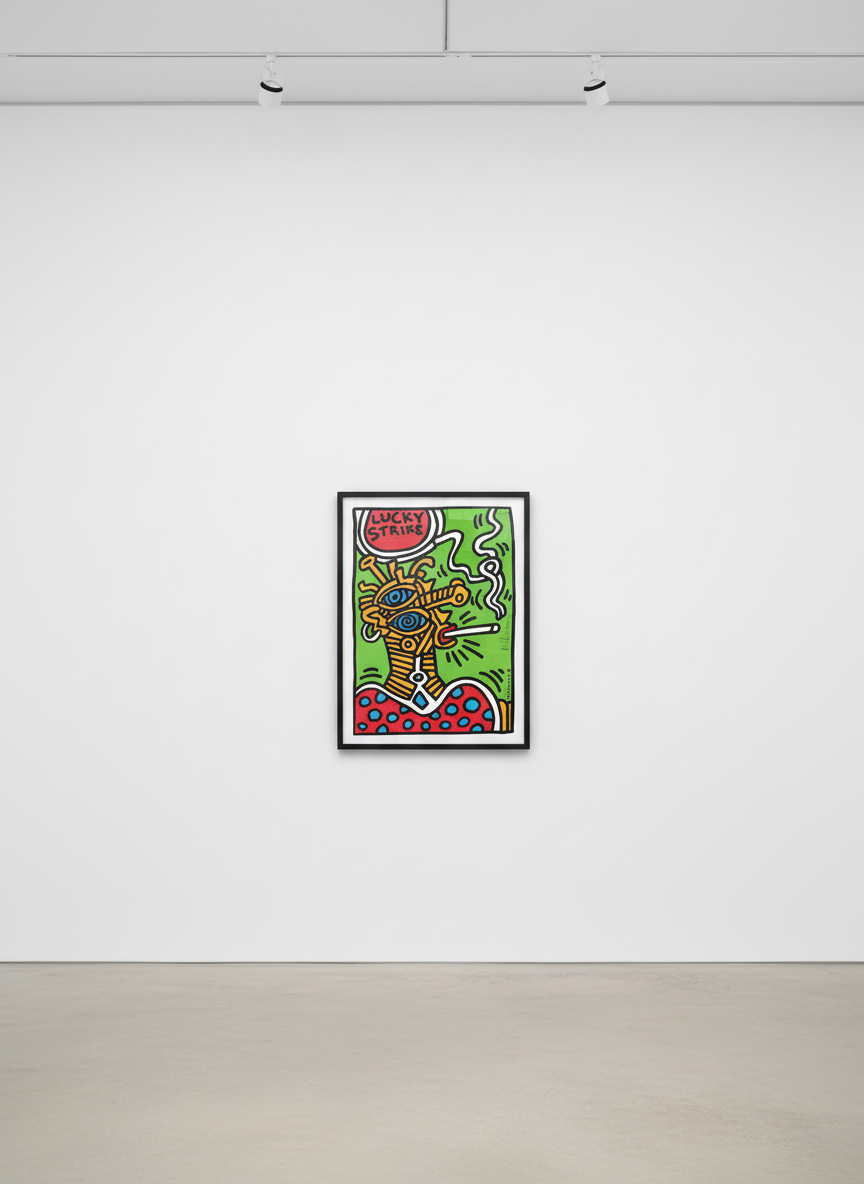
Keith Haring, Lucky Strike 1 (Littmann PP. 77), 1987. Screenprint. Available at Guy Hepner, 177 Tenth Avenue, New York. Browse Keith Haring Lucky Strike Prints →
The Icons series (1990) and its companion White Icons are among the most spiritually charged of all Haring's print portfolios. Published in the final months of his life, the six screenprints in Icons return to the most fundamental symbols of his vocabulary — the radiant baby, the barking dog, the angel, the dancing figure — and render them with a clarity and monumental weight that reflects his awareness of mortality and his desire to distil his life's visual thinking into its most essential form. The White Icons present the same imagery in a reversed colourway, with white or silver figures on dark grounds, producing a cooler, more contemplative register.
The Bad Boys series (1986) comprises six large-format screenprints that are among the most explicitly political and sexually charged of Haring's print editions. The imagery draws on graffiti writing, queer sexuality and the energy of New York's street culture in the early 1980s, and the prints retain an abrasive vitality and an unapologetic directness that makes them among the most sought-after in the secondary market. The series was published by George Mulder Fine Arts in Amsterdam and is well-documented in both the Littmann catalogue and the auction record.
The Lucky Strike series (1987) applies Haring's visual language to the iconography of the Lucky Strike cigarette brand as a sustained act of culture jamming. The prints are among his most graphically inventive and darkly humorous, subverting a commercial image whose own history of manipulation Haring turns against itself. The Lucky Strike series occupies a distinct position in the market: its combination of iconic design heritage and activist subversion makes it attractive to collectors across categories.
The Stones">Stones series (1987) is a portfolio of six screenprints notable for its particular compositional density and abstraction. Interlocking figures form patterns that suggest simultaneously organic growth and industrial entanglement, and the works reward close attention in ways that the more immediately legible Pop Shop editions do not always demand. The Stones series represents Haring at his most formally rigorous.
The Apocalypse series (1988) is the product of Haring's collaboration with William S. Burroughs — one of the most unexpected and productive pairings in late twentieth-century art. Burroughs provided texts drawn from his own late writing; Haring provided images that responded to, extended and in some cases contradicted the textual content. The resulting portfolio of ten large screenprints, published by George Mulder Fine Arts, is among the most ambitious and genuinely disturbing of Haring's career. The combination of two uncompromising figures — Burroughs from the Beat literary tradition, Haring from the downtown visual art scene — produced work that remains unsettling and that has performed strongly at auction in recent years.
The Pop Shop I through Pop Shop VI series (1987–1990) represents the broadest and most accessible range of Haring's print production. These works appear most frequently in the secondary market and are the most widely recognised; they are also the most varied in terms of composition, imagery and scale. Pop Shop I (1987) established the format — dense, energetic, multi-figure compositions printed in vivid primary colours — that the subsequent editions developed and refined. The Pop Shop III portfolio is particularly prized for its compositional complexity.
The Blueprint Drawings (1990) are Haring's final major print series: seventeen large-format screenprints on blueprint paper, printed in a blue-on-blue colourway that gives these works a quality quite unlike anything else in his output. Produced in the months before his death, they are among the most powerful of his late works and among the most sought-after in the current market. A full discussion of this series appears in the following section, and a dedicated retrospective overview is available in our Retrospect-a-monumental-celebration-of-symbol-and-scale">Keith Haring retrospect article.
After his HIV diagnosis in 1988, Haring worked with a concentration and urgency that produced some of the most significant and moving work of his career. He was not slowing down; if anything, the awareness of finite time accelerated his output and sharpened his focus. He continued to paint murals in hospitals and schools, created major public works across Europe and the United States, published prints and exhibited internationally. The pace was extraordinary for an artist managing the physical effects of an illness that, in 1988, still had no effective treatment and for which the social stigma remained savage. Haring refused both the stigma and the sentiment. He worked.
In 1989, Haring established the Keith Haring Foundation with a dual mandate: to provide funding and imagery to AIDS organisations and children's art programmes, and to preserve and promote the artist's legacy through publication, licensing and institutional relationships. The Foundation was operational within Haring's own lifetime — a measure of his clear-eyed awareness that the work needed institutional protection if it was to continue serving the public functions he intended for it. He appointed trusted friends and collaborators to its board and ensured that the estate would be managed in a way that reflected his core values: accessibility, activism and openness.
The Blueprint Drawings, published in 1990 and among the final works Haring authorised in his lifetime, are a portfolio of seventeen large-format screenprints on blueprint paper — the translucent blue architectural drafting medium used by engineers and builders to represent structures not yet built. The choice of support was not accidental. Blueprint paper carries its own associations: technical precision, planning, the future, the gap between a design and its realisation. Haring's imagery — his full visual vocabulary of dancing figures, radiant babies, barking dogs and interlocking bodies — appears in a blue-on-blue colourway that makes these prints simultaneously familiar and strange, as though the symbols have been translated into a language you know but cannot quite read. The works feel monumental even at human scale, and they have a measured, almost architectural quality that distinguishes them from the kinetic energy of the early Pop Shop prints.
Keith Haring died on 16 February 1990, of complications from AIDS. He was thirty-one years old. In the decade since his move to New York, he had produced an estimated ten thousand works across virtually every medium and surface available to him, established a foundation, opened a retail store, painted murals on five continents, published major print portfolios with international publishers, and built an audience that spanned every economic and cultural boundary he encountered. The scale of what he accomplished in so short a time remains, by any measure, astonishing.
Keith Haring, Blueprint Drawing 7 (Littmann PP. 178), 1990. Screenprint on blueprint paper. Available at Guy Hepner, 177 Tenth Avenue, New York. Browse Keith Haring Blueprint Drawings at Guy Hepner →
More than three decades after his death, Keith Haring's influence on visual culture is pervasive in ways that extend well beyond the art market. His visual language has been absorbed into graphic design, street art, fashion, animation and popular culture to a degree that makes it genuinely difficult to isolate his impact from the visual environment it helped to create. Artists as formally varied as Takashi Murakami, Shepard Fairey and KAWS have acknowledged Haring as a foundational influence; designers at brands from Supreme to Louis Vuitton have licensed or referenced his imagery; his foundation has funded thousands of community art projects in underserved communities around the world. The argument Haring made throughout his life — that art could be popular without being compromised, and that accessibility was a form of radicalism — has become one of the founding principles of post-1990 visual culture.
Keith Haring, Angel, from White Icons (Littmann PP. 173), 1990. Screenprint. Available at Guy Hepner, 177 Tenth Avenue, New York. Browse Keith Haring White Icons Prints →
Institutionally, Haring's reputation has been consolidated by a sequence of major retrospectives that have introduced his work to successive generations. The Brooklyn Museum presented a comprehensive survey in 2008 that drew the largest attendance figures in the museum's recent history. Tate Liverpool's 2019 retrospective reintroduced his work to a British audience and demonstrated, forcefully, the continued relevance of his activist imagery in an era of renewed political polarisation and pandemic-era public health crisis. The Stedelijk Museum in Amsterdam — which gave Haring one of his first major European retrospectives in 1986 — has continued to collect and present his work as a cornerstone of its late twentieth-century holdings. Each of these retrospectives has been accompanied by scholarly catalogues that have deepened the critical and art-historical literature around his practice.
At auction, the Keith Haring market is robust, diversified and consistently active. Major paintings and large-format drawings have achieved eight-figure sums at Christie's, Sotheby's and Phillips in recent years, while print editions regularly achieve five- and six-figure results across all the major salesrooms. The most consistently strong performers among the prints are the major portfolios — Icons, Blueprint Drawings, Apocalypse — which combine rarity (most are limited to between 70 and 100 impressions) with substantial art-historical significance and strong provenance through publication by recognised European and American publishers. Works from the Pop Shop series and the Bad Boys portfolio also perform strongly, benefiting from wide recognition, institutional exhibition history and the active collecting interest of a younger generation entering the market.
The Keith Haring Foundation's authentication process is a critical factor in market confidence. Works that carry Foundation certificates command measurable premiums over comparable works without documentation, regardless of apparent visual quality or provenance history. The Foundation maintains records of all known lifetime editions and posthumous estate publications and issues authentication opinions through a formal process that dealers, auction houses and collectors rely on as the primary standard of due diligence. Any serious acquisition of Keith Haring original art for sale should include a verification step with the Foundation's records, whether or not a certificate is already present.
For collectors approaching the market to buy Keith Haring prints for the first time, the print editions are the natural and most thoroughly documented starting point. They are catalogued comprehensively in the Littmann catalogue raisonné — the primary scholarly reference for Haring's printed output, covering each work with its edition size, publisher, printer, publication date, physical dimensions and a detailed description of the image. Any serious acquisition, whether through a specialist dealer like Guy Hepner or through the auction market, should be cross-referenced against the Littmann catalogue before proceeding. Discrepancies between a work's physical characteristics and its catalogue entry require explanation.
Edition markings are the first element to examine in any Keith Haring print. Lifetime editions are typically numbered in pencil in the lower margin in the format "XX/YY" — the impression number over the total edition size — with Haring's signature, usually in black or coloured marker, in the lower right or lower left margin. Most major portfolios have edition sizes of between 70 and 100 impressions, with a small number of artist's proofs, printer's proofs and hors commerce impressions existing outside the main numbered edition. Works that are numbered but unsigned, or signed but unnumbered, may be legitimate — some trial proofs exist in this form — but should be carefully documented and their status explained before purchase.
A certificate of authenticity is essential to any confident acquisition. For works produced and published during Haring's lifetime, the certificate typically originates with the publisher — most commonly George Mulder Fine Arts in Amsterdam, Parasol Press, or one of the other publishers with whom Haring collaborated. For works authenticated posthumously, the Keith Haring Foundation issues its own documentation. Both forms of certification are accepted by the market; neither substitutes for thorough provenance research, but both significantly reduce the risk of acquiring a work of uncertain origin.
Condition is a particularly important consideration for Keith Haring screenprints on paper, which are susceptible to foxing, ultraviolet fading, surface abrasion and the moisture damage that comes from improper storage. Haring used high-quality archival papers for most of his major print editions, and well-stored examples in original condition are still available in the market. When examining a print, look for even colour intensity across the image area — fading at the margins or in areas of heavy pigment concentration is a warning sign — clean margins without handling creases or skinning damage, and no evidence of moisture damage to the paper support. For the Blueprint Drawings series specifically, the blue of the blueprint paper ground should be consistent and unfaded; prolonged exposure to light can bleach the background significantly, altering the intended relationship between figure and ground.
The distinction between lifetime prints — those published and hand-signed by Haring during his lifetime — and posthumous estate editions — those published by the Keith Haring Foundation after his death, sometimes from the same screens — is one that affects pricing and collecting rationale. Lifetime prints command a premium in the market, and they appear more frequently in the established auction record, giving them better price discovery and a more robust resale history. Posthumous estate editions are legitimate and fully authenticated, but they are generally priced below equivalent lifetime editions and are treated differently in institutional acquisition contexts.
Price ranges vary substantially by series, edition size, condition, provenance and current market demand. Entry-level Pop Shop prints in good condition can be found in the market at four-figure sums, making them among the most accessible Keith Haring paintings for sale in terms of price. The Bad Boys and Lucky Strike series occupy the middle range of the market, typically achieving strong five-figure results for well-documented examples in good condition. Major works from the Icons, Blueprint Drawings and Apocalypse portfolios regularly achieve five- to six-figure results through specialist dealers and the principal auction houses. For collectors at every level, the fundamental principles are the same: buy from reputable sources, verify documentation against the Littmann raisonné, prioritise condition, and take the long view. Haring's market has demonstrated consistent strength across economic cycles, and the depth of his cultural influence provides a foundation for sustained collecting interest well beyond the current generation.
Browse all Keith Haring prints available at Guy Hepner, 177 Tenth Avenue, New York, NY 10011.
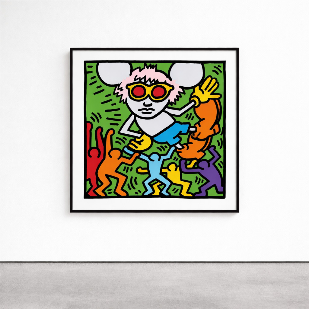
Explore Keith Haring prints for sale at Guy Hepner: Andy Mouse, Apocalypse, Bad Boys, Chocolate Buddha, Fertility.
Related Series