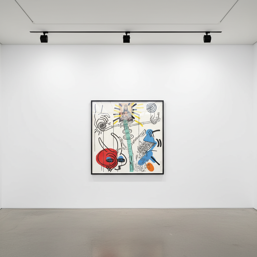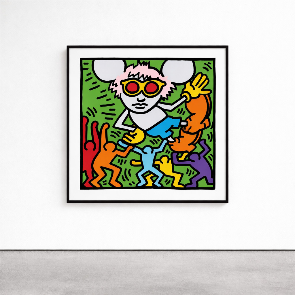
Andy Mouse
Keith Haring's art is instantly recognizable: bold black lines, vibrant colors, and simplified, energetic figures that seem to pulse with life. While his style is often associated with spontaneity and accessibility, Haring's work is underpinned by a sophisticated use of semiotics—the study of signs and symbols as elements of communicative behavior. Through his unique visual language, Haring crafted a powerful system of signs that transcended words, allowing his art to speak directly to diverse audiences across cultural and linguistic boundaries. Understanding the semiotics of Keith Haring reveals an artist whose deceptively simple imagery carries profound depth, making his work as intellectually significant as it is visually compelling.
From the outset of his career, Keith Haring saw art not as a commodity confined to galleries but as a democratic medium for communication. Influenced by semiotic theories, particularly those of Roland Barthes and Ferdinand de Saussure, Haring recognized the power of signs in shaping meaning and cultural understanding. In the New York subways of the early 1980s, Haring began drawing with white chalk on unused black advertising panels. These became the canvas for his early pictograms—dogs, babies, flying saucers, and radiant figures that would become his signature iconography.
Haring's subway drawings functioned as what semioticians call a sign system. Each element carried specific meaning while remaining open to interpretation. The radiant baby, perhaps his most famous symbol, represented purity, hope, and the potential of humanity. The barking dog symbolized oppression and the abuse of power. These weren't arbitrary choices but carefully developed signs that Haring refined through repetition, allowing viewers to build familiarity and understanding over time.
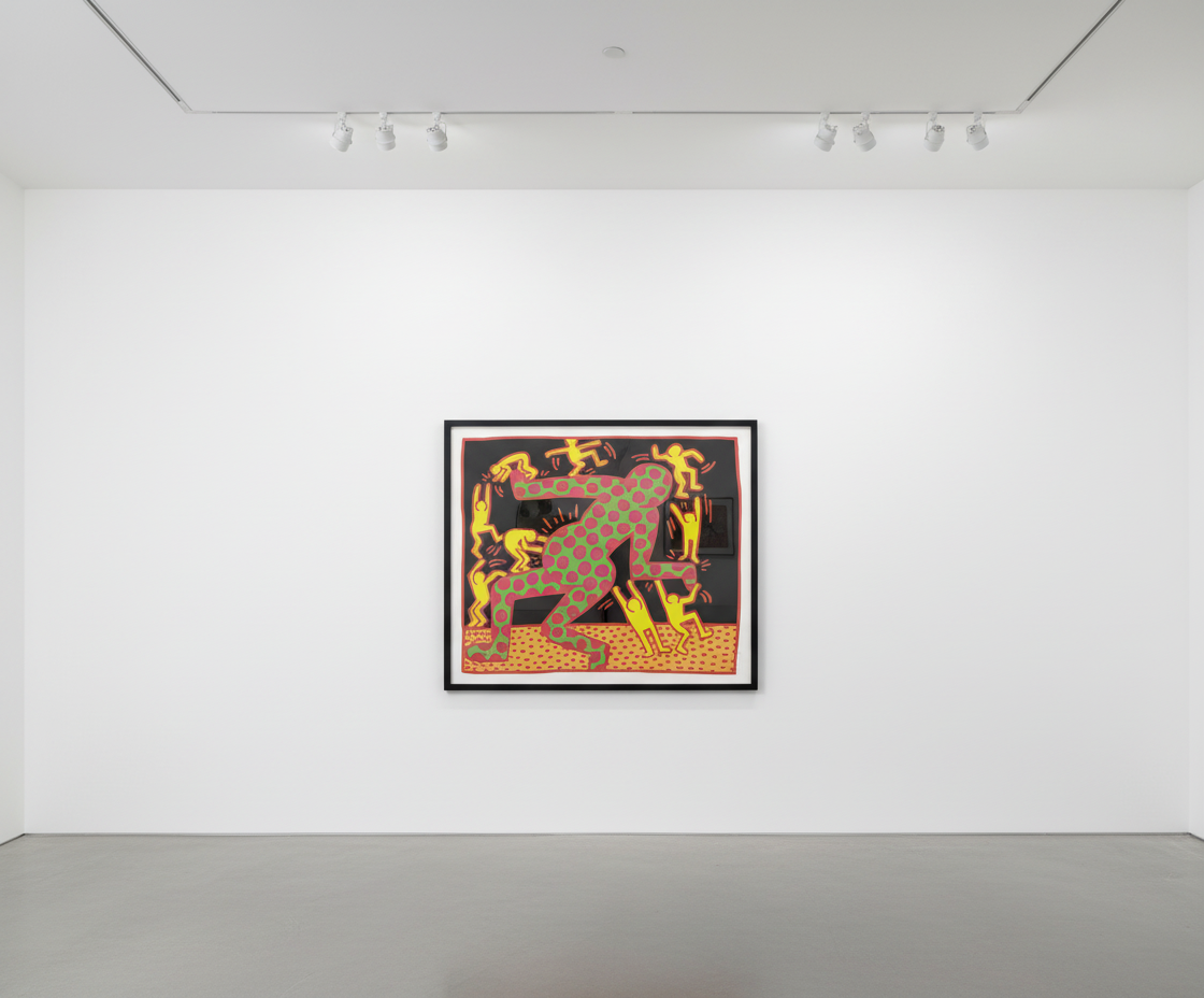
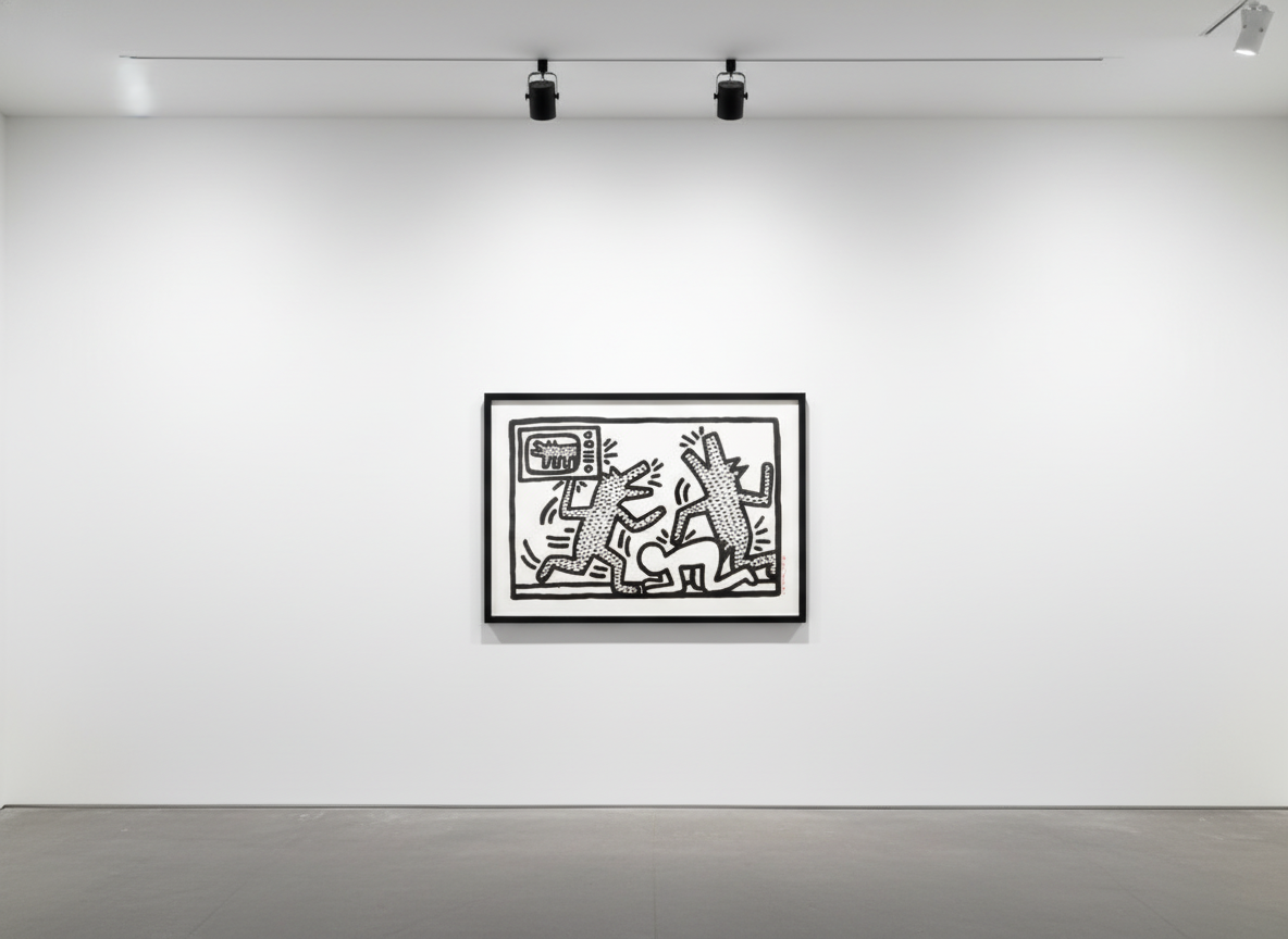
Untitled III (Littmann PP. 20) — Keith Haring. Available at Guy Hepner, New York.
The accessibility of Haring's visual vocabulary was intentional. He understood that effective communication required shared understanding between artist and audience. By deploying his symbols in public spaces, he created a parallel language system that competed with corporate advertising and governmental signage. His work demonstrated that art could function as a form of mass communication while retaining aesthetic and conceptual integrity.
Central to the semiotics of Keith Haring is his distinctive use of line. His continuous, unwavering black outlines serve multiple semiotic functions. First, they create immediate legibility—figures are recognizable at a glance, whether viewed on a subway platform or a gallery wall. Second, the consistent line weight establishes what linguists call register, a uniform mode of expression that signals coherence across his entire body of work.
Haring's figures exist in constant motion, their limbs extended, bodies twisted, and forms interlocking. This kinetic quality is itself a sign, representing energy, vitality, and the interconnectedness of human experience. When multiple figures appear together, their relationships create syntactic meaning. Figures supporting one another suggest solidarity and community. Figures in conflict represent social struggle and oppression. The arrangement of elements on the picture plane functions like grammar, organizing individual signs into coherent statements.

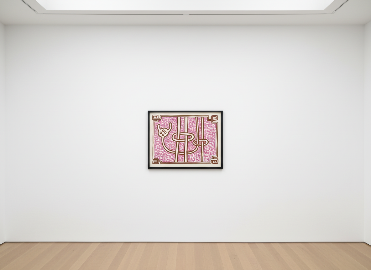
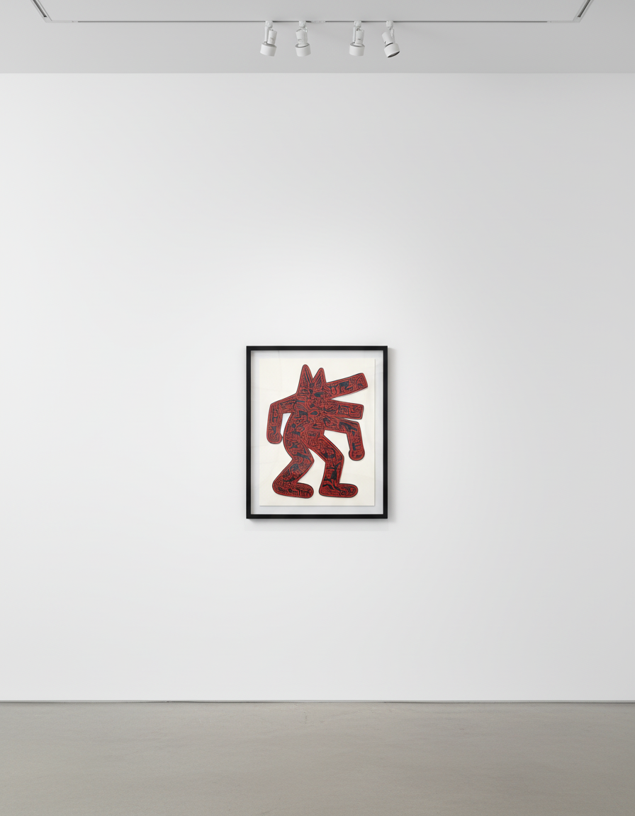
The Story of Red and Blue 9 (Littmann PP. 131) — Keith Haring. Available at Guy Hepner, New York.
Color operates as another semiotic layer in Haring's practice. His palette of primary and secondary hues—red, yellow, blue, green—carries cultural associations that inform interpretation. Red suggests passion, danger, or urgency. Blue evokes stability and contemplation. Haring deployed these associations strategically, using color to amplify or complicate the meanings generated by his linear forms. The interplay between line and color creates what semioticians describe as polysemy, the capacity of signs to generate multiple simultaneous meanings.
Beyond formal analysis, the semiotics of Keith Haring reveals an artist deeply engaged with the social and political issues of his time. His iconographic vocabulary addressed AIDS awareness, apartheid, nuclear disarmament, and LGBTQ rights. The crawling baby surrounded by radiation lines commented on nuclear anxiety. Figures with television sets replacing their heads critiqued media manipulation. Crosses, pyramids, and religious imagery questioned institutional power.
Haring's genius lay in encoding these messages in forms that remained visually appealing and accessible. Unlike traditional protest art, which often relies on explicit imagery and text, Haring communicated through symbolic compression. His signs functioned as what Barthes termed myths—images that naturalize ideological content, making social commentary appear as universal truth rather than partisan argument.
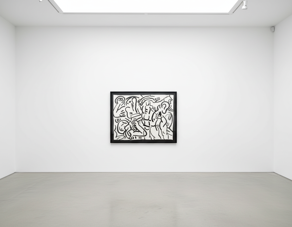
Dog — Keith Haring. Available at Guy Hepner, New York.
The Pop Shop, which Haring opened in 1986, represents another dimension of his semiotic practice. By placing his imagery on affordable merchandise, he challenged the distinction between high art and commercial design. This gesture questioned the sign systems of the art market itself, interrogating how value and meaning are assigned to cultural objects. The Pop Shop democratized access to his visual language while simultaneously commenting on commodification and authenticity.
The auction market has consistently validated the importance of Keith Haring's semiotic contributions. According to data from Christie's and Sotheby's, Haring's works have achieved substantial results across all categories, from unique paintings to editioned prints. The 2024 Art Basel and UBS Art Market Report identified Haring among the most sought-after post-war artists, with particularly strong demand from collectors under forty-five who respond to his fusion of accessibility and conceptual depth.
Collectors are drawn to Haring's work for reasons that directly connect to his semiotic achievements. His visual language transcends cultural specificity, making his pieces legible and meaningful across international markets. The consistency of his sign system ensures that individual works participate in a larger artistic project, increasing their art-historical significance. Furthermore, his engagement with enduring social themes—human rights, equality, and the power of communication—resonates with contemporary concerns, ensuring continued relevance.
Guy Hepner is pleased to offer exceptional works by Keith Haring, including significant prints and editions that demonstrate the artist's masterful command of semiotics and visual communication. Our collection features carefully selected pieces that represent key moments in Haring's artistic development. For inquiries regarding available works by Keith Haring, pricing information, or to arrange a private viewing, we invite collectors to contact our gallery directly. Our specialists are prepared to assist with acquisitions that will enhance any collection with Haring's iconic and enduring visual language.
Explore Keith Haring prints for sale at Guy Hepner: Andy Mouse, Apocalypse, Bad Boys, Chocolate Buddha, Fertility.
Related Series