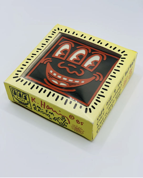
Haring's distinctive artistic vocabulary found perfect expression in the Keith Haring Pop Shop format. His signature style—continuous black outlines forming dancing figures, barking dogs, radiant babies, and flying saucers—translated seamlessly from subway walls to commercial products. The artist's hieroglyphic-inspired symbols carried universal meanings: the radiant baby represented purity and potential, the barking dog suggested loyalty and protection, while dancing figures embodied joy and movement.
The Pop Shop aesthetic maintained Haring's commitment to bold, vibrant colors and simplified forms. Each design utilized his characteristic technique of continuous line drawing, creating images that were immediately recognizable and emotionally accessible. This visual consistency across different media—from t-shirts to posters to buttons—established a cohesive brand identity that reinforced Haring's artistic philosophy.
-
-
-
The View