-
Ed Ruscha's art across prints, paintings and installations has firmly cemented him as one of the world's most important artists. In a career lasting over 6 decades, his visual & language based artworks have defined the modern experience making the ordinary extraordinary. Browse Ed Ruscha art for sale at Guy Hepner, Ruscha dealers since 2005.
-
Latest: Ed Ruscha Prints for Sale
-
-
Series

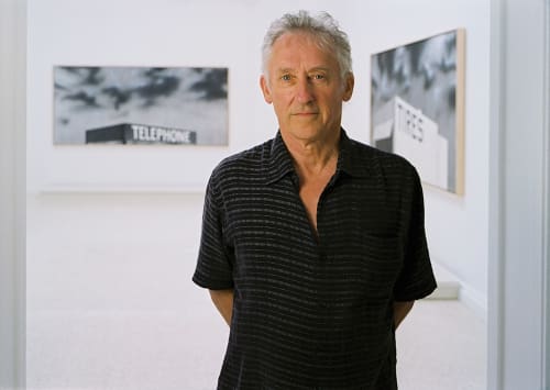
Ed Ruscha
That Was Then, This Is Now , 2014Lithograph34 1/2 x 46 in
87.6 x 116.8 cmEdition of 75 + 12 APs + second run edition of 11Series: Other EditionsCopyright The ArtistEd Ruscha’s That Was Then, This Is Now captures the slippery nature of time and memory through a deceptively simple phrase. Rendered in his signature typographic style, the work presents...Ed Ruscha’s That Was Then, This Is Now captures the slippery nature of time and memory through a deceptively simple phrase. Rendered in his signature typographic style, the work presents a statement that is both universally familiar and quietly profound. With its clean composition and deadpan delivery, the piece invites viewers to reflect on change - personal, cultural, or historical - without sentimentality. As always, Ruscha uses language not to explain, but to open a space for contemplation. That Was Then, This Is Now exemplifies his talent for transforming everyday expressions into poetic, open-ended meditations on the passage of time.Overview
"I'm interested in glorifying something that we in the world would say doesn't deserve being glorified."
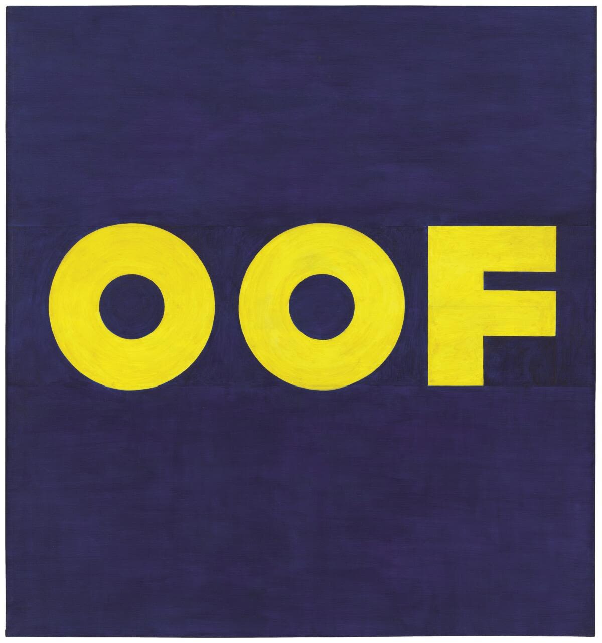
Ed Ruscha’s art is art of the everyday that brings a sense of the extraordinary to the ordinary. There is a magical sense of exploration within the art of Ed Ruscha which challenges our conventions and brings to life the often overlooked. During his career that has spanned over seven decades, Ed Ruscha’s prints, paintings and installations have redefined and informed the dialogue around art itself. As one of the pioneering figures of the American pop-art movement of the 1960s, Ruscha’s distinctive style saw the artist rise to fame for blend of high and low, accessible cultures that draw inspiration from everyday items such as branding and packaging, the cityscapes of Los Angeles, popular culture, and the American West.
Ruscha’s art is characterized by his use of a range of linguistic devices in his text pieces such as onomatopoeia, puns, alliteration and contrasting meanings. Many of his early works such as Honk 1962 depict single words in a strong typographic format.
Ruscha became well known in the late 1950s through the creation of small collages using images and words taken from everyday sources such as advertisements in magazines and newspapers. A style which he developed over the course of his career. Exploring universal themes of consumerism, the American Dream, and our modern, urban landscape, Ed Ruscha’s prints and paintings capture an artist whose bold use of visual and linguistic signs are coding with a joyous celebration of life. Throughout Ed Ruscha’s print output we see an artist distill the essence of his artistic vision into more accessible formats styles, textures and colors and showcase the evolution of his work,
At Guy Hepner, we have assisted collectors across the world to buy Ed Ruscha art. From our New York and London galleries, we offer a selected range of Ed Ruscha prints and paintings and can source works from his seven decade career Whether new to collecting Ed Ruscha prints, or an experienced collector, our knowledge and experienced team can help you.
For further information on our available Ed Ruscha limited edition prints for sale or to buy original Ed Rushcha art, contact info@guyhepner.com
ExhibitionsNews