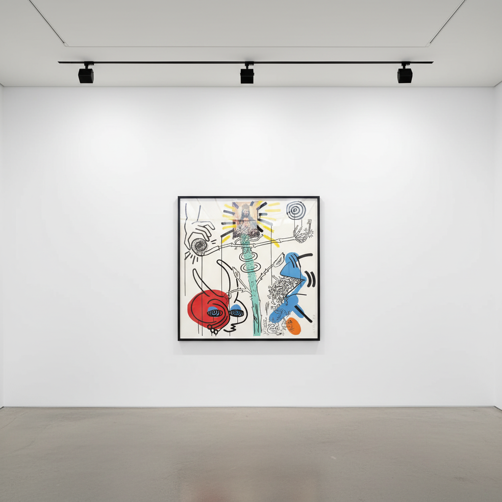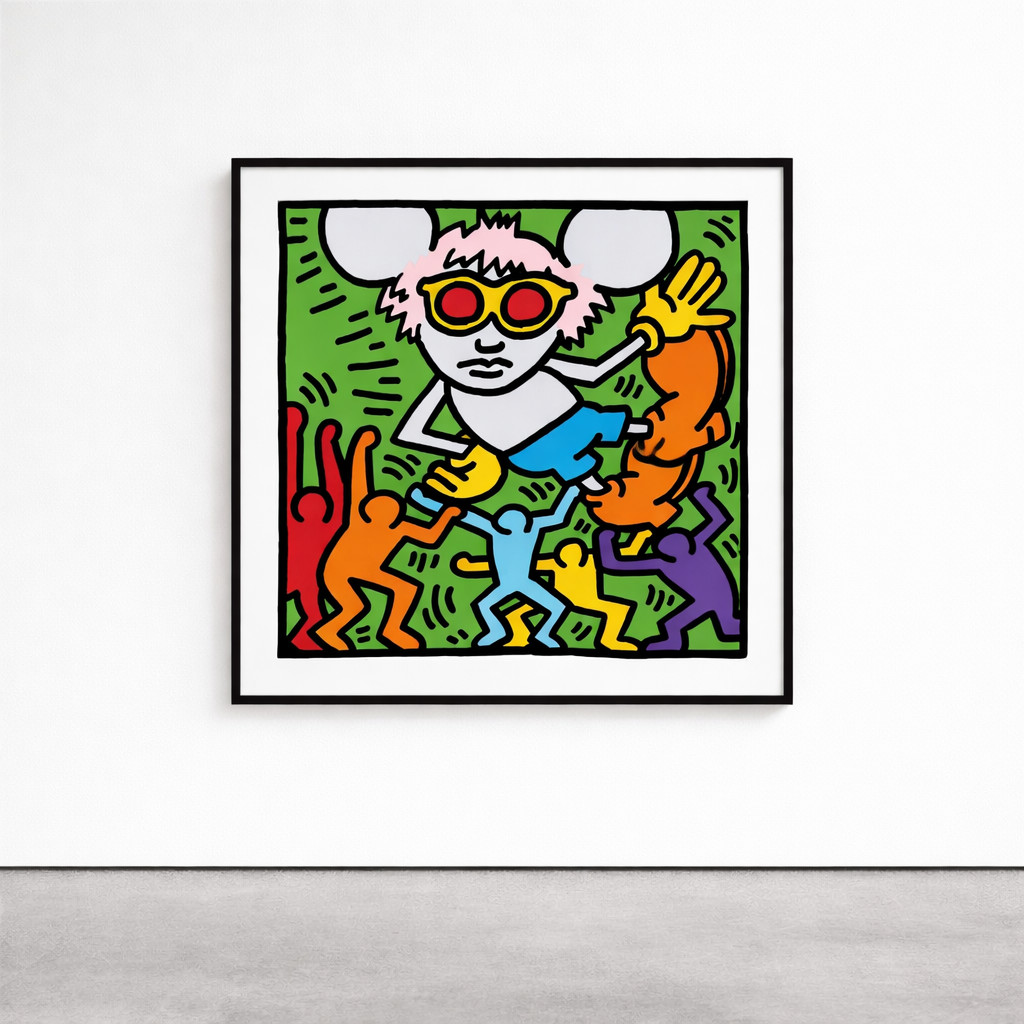
Andy Mouse
Keith Haring remains one of the most influential and instantly recognizable artists of the twentieth century. His explosive street-inspired visual language—radiant babies, barking dogs, and writhing figures outlined in bold, cartoon-like strokes—transformed public spaces into vibrant canvases and democratized contemporary art for an entire generation. Yet beneath the vivid colors and kinetic energy that defined his subway drawings and large-scale murals lies a deep and evolving exploration of line, gesture, and form. Nowhere is this tension between exuberance and restraint more apparent than in Keith Haring's powerful works executed in sumi ink on paper. This lesser-known but profoundly expressive body of work highlights a subtler, more contemplative side of Haring's practice—one that marries his spontaneous visual instincts with the discipline and elegance of East Asian brush painting traditions.
By adopting sumi ink, a traditional Japanese medium with roots stretching back over a thousand years, Haring aligned himself with centuries-old artistic traditions while continuing to communicate his radical, contemporary message. The results are works that exist in a compelling liminal space—at once urgent and timeless, minimalist and monumental, ancient in technique yet thoroughly modern in spirit.
Sumi ink is a black ink traditionally used in East Asian calligraphy and brush painting, particularly in Japan, China, and Korea. It is made from soot—often derived from burned pine or vegetable oil—mixed with animal glue, then carefully formed into ink sticks and ground with water on an inkstone immediately before use. This ritualistic preparation process connects the artist to their materials in an intimate, almost meditative way that stands in stark contrast to the immediacy of Western painting supplies.
Known for its extraordinary depth, remarkable range of tonalities, and fluid application, sumi ink rewards both precision and spontaneity. The medium captures every nuance of the artist's gesture—the speed of the brush, the pressure applied, the confidence or hesitation in each stroke. For Keith Haring, whose artistic philosophy centered on the primacy of line and the authenticity of immediate expression, sumi ink offered a perfect synthesis of Eastern philosophy and Western contemporary practice. The medium's unforgiving nature—each mark permanent and irreversible—aligned seamlessly with Haring's commitment to spontaneous, unedited creation.
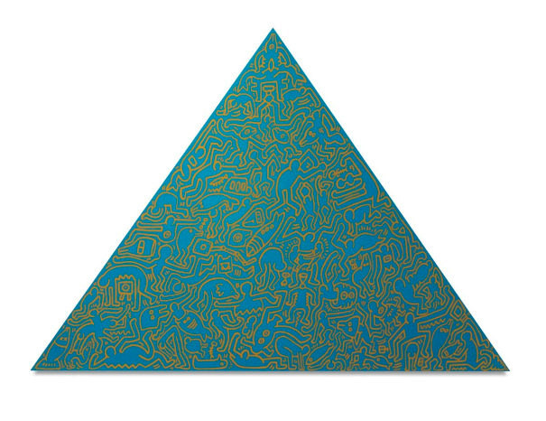
Pyramid Teal — Keith Haring. Available at Guy Hepner, New York.
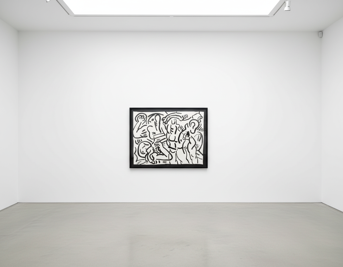
Throughout his brief but extraordinarily prolific career, Keith Haring demonstrated a remarkable openness to cross-cultural dialogue and artistic experimentation. His engagement with sumi ink represents one of the most sophisticated examples of this synthesis. While his subway chalk drawings captured the frenetic energy of 1980s New York, his sumi ink works reveal an artist deeply attuned to the spiritual and philosophical dimensions of mark-making.
The connection between Haring's approach and traditional East Asian brush painting extends beyond mere material choice. Like the great calligraphers and sumi-e masters before him, Haring understood that the line itself carries meaning—that gesture, rhythm, and flow communicate on a primal level that transcends language and cultural boundaries. His dancing figures and interconnected forms in sumi ink possess a fluidity that speaks to universal human experiences of movement, connection, and vitality.
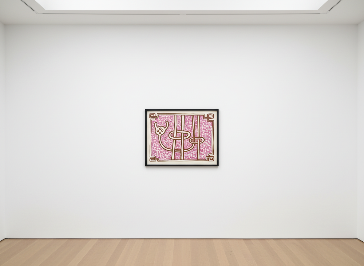
Haring's pyramid compositions exemplify this East-West synthesis with particular eloquence. These works demonstrate how the artist adapted his signature visual vocabulary to the unique properties of sumi ink, allowing the medium's inherent luminosity and tonal variation to enhance his geometric explorations. The pyramid—a form laden with historical and mystical significance across multiple cultures—becomes in Haring's hands a vehicle for examining energy, ascension, and spiritual transcendence.
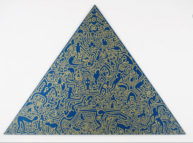
Pyramid Blue — Keith Haring. Available at Guy Hepner, New York.
The art market has increasingly recognized the importance of Keith Haring's works on paper, with auction records at Christie's and Sotheby's reflecting Growing collector appreciation for these intimate yet powerful pieces. According to the Art Basel and UBS Global Art Market Report, works on paper by blue-chip contemporary artists have demonstrated remarkable resilience and steady appreciation, particularly pieces that reveal new dimensions of an artist's practice.
Keith Haring's sumi ink works occupy a particularly compelling position within his oeuvre. They offer collectors access to the artist's most direct and unmediated creative expression while simultaneously connecting to the prestige of traditional Asian artistic heritage. Unlike his larger collaborative projects or commercially reproduced images, these works on paper represent Haring at his most essential—artist, brush, ink, and surface in immediate dialogue.
For discerning collectors, Keith Haring's sumi ink pieces present a rare opportunity to acquire works that illuminate an underexplored aspect of his artistic evolution. These pieces appeal to those who appreciate both the historical significance of Haring's contribution to contemporary art and the formal sophistication that emerges when a master draftsman engages with a demanding traditional medium. The relative scarcity of these works compared to his more widely circulated prints and multiples further enhances their desirability.
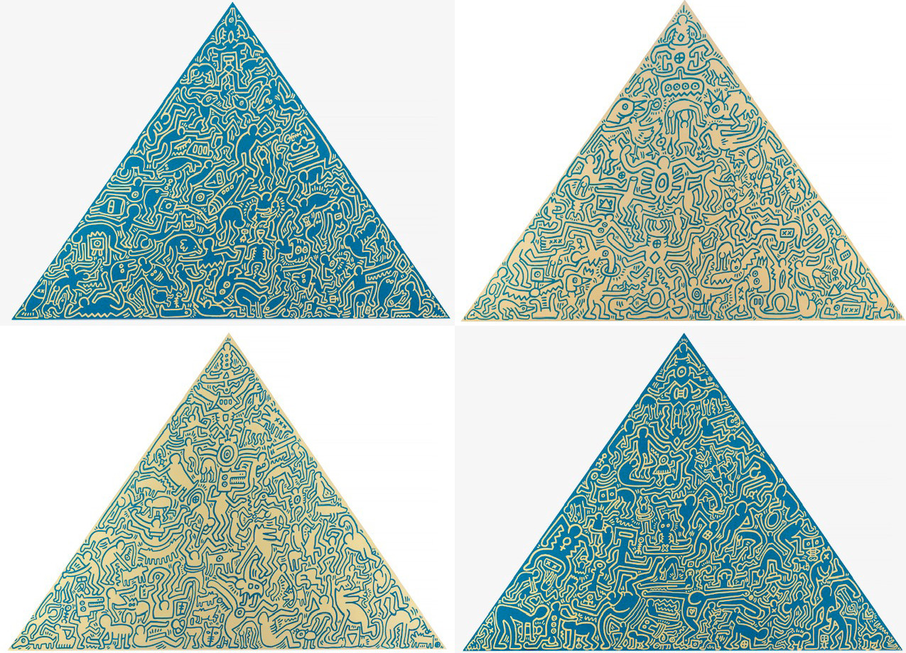
Pyramids — Keith Haring. Available at Guy Hepner, New York.
Guy Hepner is proud to offer exceptional works by Keith Haring, including rare pieces that showcase his masterful engagement with traditional materials and techniques. Our gallery maintains relationships with estates, private collections, and institutions worldwide, ensuring access to museum-quality works for our discerning clientele. Whether you are building a focused collection of twentieth-century American art or seeking a singular statement piece that bridges Eastern and Western artistic traditions, our expert team provides comprehensive acquisition services tailored to your specific requirements. To inquire about available Keith Haring works, including sumi ink pieces and pyramid compositions, please contact Guy Hepner directly to arrange a private consultation.
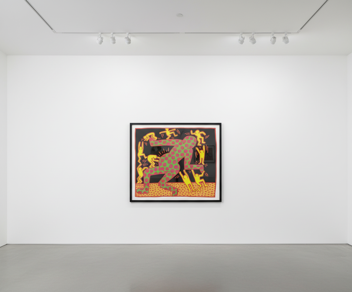
Explore Keith Haring prints for sale at Guy Hepner: Andy Mouse, Apocalypse, Bad Boys, Chocolate Buddha, Fertility.
Related Series