
Among the defining visual strategies of Pop Art, none is more closely identified with a single artist than the Ben-Day dot with Roy Lichtenstein. While Andy Warhol’s Campbell’s Soup Cans, Marilyns, and silkscreens often serve as the public face of the movement, Lichtenstein’s monumental canvases featuring enlarged comic panels and meticulously hand-painted dots established another, equally crucial mode of engaging with mass media. To grasp the significance of Lichtenstein’s Ben-Day dots, one must understand their origins in commercial printing, their transformation in the context of postwar American culture, and how their artistic appropriation differed fundamentally from Warhol’s mechanical procedures.
The Origins of the Ben-Day Dot in Printing History
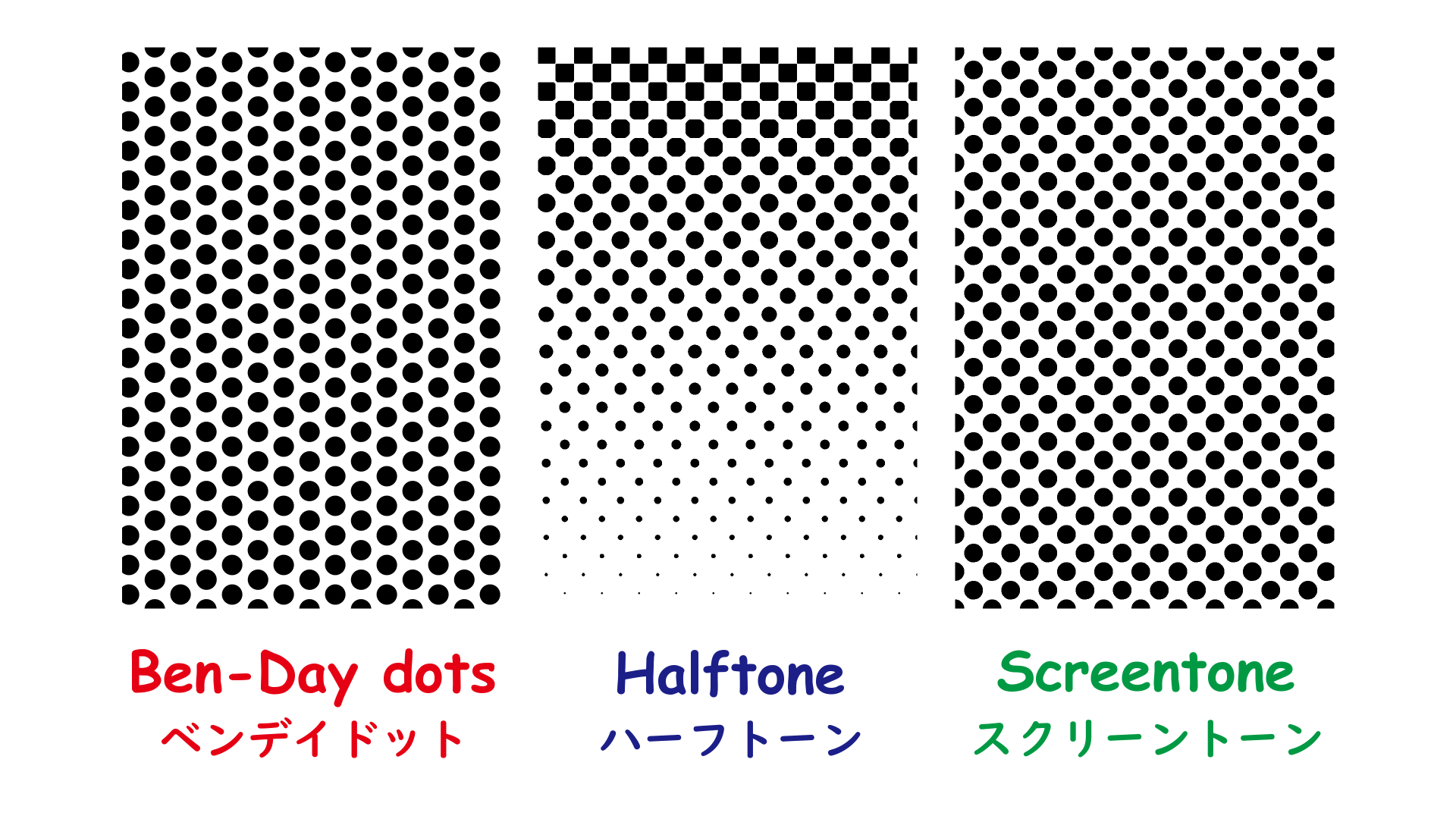
The Ben-Day process, patented in 1879 by American illustrator Benjamin Henry Day Jr., was a cost-saving innovation in commercial printing. By overlaying small, evenly spaced dots of varying density and color, printers could create gradients, tonal variations, and blended hues without the expense of continuous-tone printing. The technique became central to newspapers, advertisements, and especially comic books, where cost-efficiency and speed of production were paramount.
For most readers, Ben-Day dots were imperceptible at standard viewing distance, collapsing into seemingly solid fields of color. Yet under magnification, the dots revealed themselves as artificial, repetitive marks, exposing the industrial character of the image. It was precisely this tension—between the illusion of wholeness and the reality of mechanical construction—that Lichtenstein later exploited.

Popular Culture and the Visual Language of Comics
By mid-century, comics were one of the most ubiquitous forms of entertainment in the United States. They deployed Ben-Day dots not only for color but also to texture skin tones, clothing, skies, and other visual elements. While the dots were a pragmatic solution for publishers, they came to embody the cheapness, reproducibility, and disposability of mass culture.
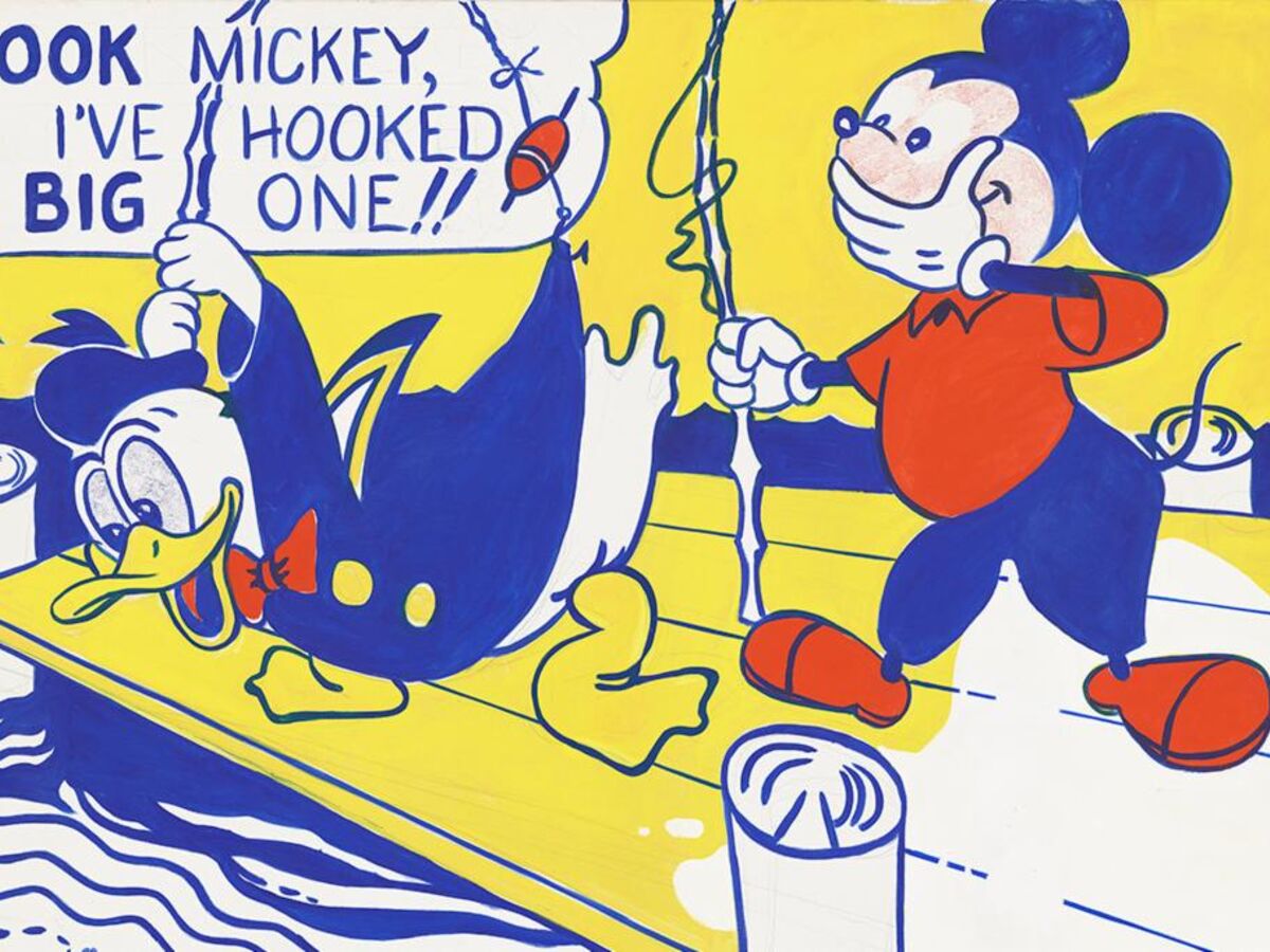
Roy Lichtenstein, trained in the tradition of modernist painting but increasingly skeptical of its seriousness, turned to these “low” cultural forms in the early 1960s. Look Mickey (1961) was a watershed moment: the painting appropriated a comic-book illustration of Donald Duck and Mickey Mouse while introducing the signature dotted surfaces that would soon define his career. Unlike comic artists, who used dots invisibly, Lichtenstein magnified and exaggerated them, turning an overlooked printing device into the centerpiece of his work.
Lichtenstein’s Method: The Hand Imitating the Machine
A crucial paradox in Lichtenstein’s practice is that his Ben-Day dots were not mechanically printed but painstakingly painted by hand. Using stencils, rulers, and brushes, he replicated the mechanical texture of comic books at a dramatically larger scale. This manual execution distinguished his work from Warhol’s, whose silkscreens truly embraced mechanization and repetition.
Lichtenstein’s dots were therefore ironic. They looked mechanical but bore the trace of artistic labor. By simulating machine-made precision through human effort, Lichtenstein highlighted the impossibility of escaping subjectivity, even in an age defined by mass reproduction. His canvases are as much about the impossibility of “pure” mechanical objectivity as they are about comics themselves.
Warhol versus Lichtenstein: Divergent Approaches to Mass Media
Although Warhol and Lichtenstein are often grouped together as the twin pillars of Pop Art, their strategies diverged significantly. Warhol sought to collapse the distinction between art and commercial production by adopting the techniques of mass manufacture. His use of silkscreen printing minimized the artist’s hand, embraced repetition, and turned art into a commodity indistinguishable from consumer products. In Warhol’s famous phrase, he wanted to be “a machine.”
Lichtenstein, by contrast, did not eliminate the artist’s hand but rather dramatized its tension with the mechanical. His dots parody mechanical reproduction precisely because they are labor-intensive simulations of it. Where Warhol silkscreened Marilyn Monroe to echo the endless reproducibility of celebrity culture, Lichtenstein enlarged a single comic panel to monumental scale, transforming the ephemeral into the monumental and exposing its underlying structure.
In other words, Warhol performed mass media; Lichtenstein analyzed it. Warhol’s Campbell’s Soup Cans align painting with consumer packaging, while Lichtenstein’s dots dissect the very grammar of print culture, slowing down the experience of looking at comics and rendering visible what was designed to remain unseen.

Iconic Works and the Function of the Dot
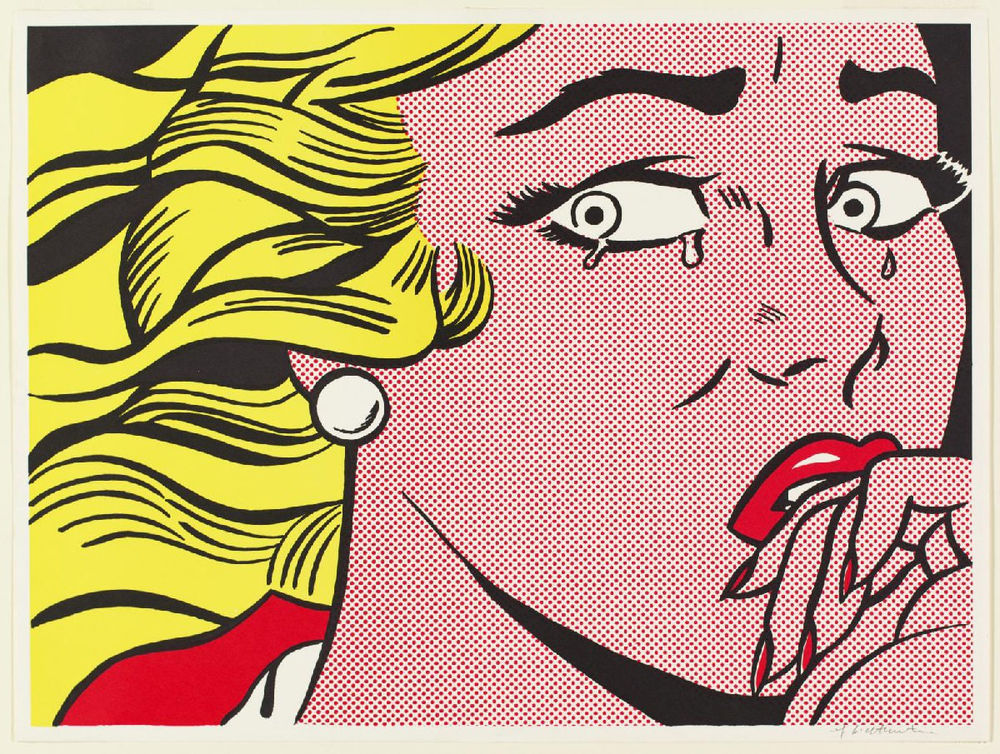
In works such as Drowning Girl (1963) or Whaam! (1963), the dots serve multiple roles. They establish a flat, depersonalized surface that resists illusionistic depth; they point to the artifice of emotional clichés depicted in romance and war comics; and they signal the tension between individual expression and cultural stereotype.
Drowning Girl, for instance, transforms a melodramatic comic-book panel into a meditation on representation. The woman’s face is covered in regimented red dots, her tears rendered in stylized arcs, and her speech bubble declares her refusal to be saved by “Brad.” The uniformity of the dots denies the uniqueness of her face, reducing her individuality to a pattern. At the same time, Lichtenstein’s meticulous hand reveals the labor involved in constructing such uniformity.
In the Brushstrokes series (1965–66), Lichtenstein further weaponized the dot against Abstract Expressionism. Here, the dots are used to parody the supposedly spontaneous gestures of artists like Jackson Pollock or Willem de Kooning. What was once understood as the authentic expression of the artist’s psyche becomes, in Lichtenstein’s treatment, a mechanical cliché—a “brushstroke” rendered with cartoon-like clarity and artificial dots.

The Dot as Semiotic Device
From a semiotic perspective, the Ben-Day dot in Lichtenstein’s work functions as a signifier of mass culture rather than a mere visual effect. It points to the systems of mediation that shape perception, reminding viewers that what they see is never a transparent window to reality but always a coded construction.
Unlike Warhol, whose silkscreens often revel in surface without interpretation, Lichtenstein engages in structural critique. His works expose the mechanics of vision itself: the way mass culture relies on modular, repeatable, and interchangeable units—dots, pixels, stereotypes—to generate meaning. In doing so, he anticipates later postmodern concerns with simulation, mediation, and the instability of originality.
Critical Reception and Theoretical Debates
At the time of their emergence, Lichtenstein’s dot paintings were met with skepticism and even hostility. Critics accused him of plagiarism, pointing out that his canvases often lifted panels wholesale from obscure comic artists. Others dismissed the works as ironic gimmicks lacking the gravitas of high art. Yet defenders argued that Lichtenstein’s very point was to destabilize traditional categories of originality, authorship, and artistic hierarchy.
Art theorists in the 1960s and 1970s increasingly recognized the dots as a sophisticated commentary on the reproducibility of culture. Lichtenstein’s practice echoed Walter Benjamin’s famous essay on the “work of art in the age of mechanical reproduction,” yet with a twist: his dots insist that even mechanical reproduction is mediated by the hand of the artist, by decisions of framing, scale, and context.
From Dots to Pixels
In the digital era, Lichtenstein’s dots acquire new resonance. Their modularity and grid-like structure prefigure the pixel, the building block of digital images. Just as Ben-Day dots revealed the artificiality of mass print culture, pixels remind contemporary viewers of the constructed nature of screen-based imagery. In this sense, Lichtenstein’s work anticipated the visual grammar of digital media decades before its rise.
By comparison, Warhol’s silkscreens resonate more with today’s culture of viral replication and celebrity branding. Warhol predicted a culture of endless circulation and commodification, while Lichtenstein foreshadowed a culture built from modular units of visual code.
The Intellectual Legacy of the Dot
Roy Lichtenstein’s transformation of the Ben-Day dot was more than stylistic innovation; it was a conceptual intervention into the very nature of representation. Unlike Warhol, who embraced the logic of mass production, Lichtenstein staged the paradox of the hand-made machine mark. His dots expose the mechanics of media while also parodying the cultural clichés those mechanics perpetuate.
More than half a century later, Lichtenstein’s dots remain a potent reminder of how images are constructed, circulated, and consumed. They are not only the residue of 20th-century print culture but also precursors of the 21st-century digital pixel. In turning a humble printing device into a tool of critical inquiry, Lichtenstein helped redefine what art could be in the age of mass communication.
For more information on our Roy Lichtenstein prints for sale contact our galleries via info@guyhepner.com.
